The content guidelines are a supplement to other component guidelines on the Telescope website. As such, we should only really include guidelines on how to write copy for components and not include usage guidelines or accessibility guidelines.
Our template is heavily inspired by Adobe’s Spectrum (example for their Button).
A standard guideline block
To keep things organised and consistent, we try to use the same pattern and format for each of our content guidelines. Repeating the same structure between components help make our guidelines easy to scan and consume.
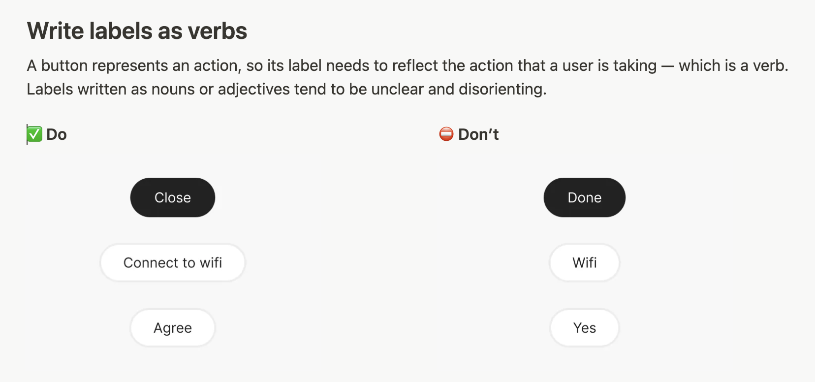
Let’s break this down and discuss each part of this guideline block.
Headings
With inspiration from Spectrum, we always use prescriptive headings. This directness leaves little room for ambiguity, ensuring that the intended action is easily understood and essentially makes the guideline actionable rather than just informative.
Write labels as verbs
Paragraphs
Provide specific, actionable instructions that team members can follow. Avoid vague language and ensure that each guideline gives clear direction on what to do or not do. Ideally provide context and explain why we have this practice.
A button represents an action, so its label needs to reflect the action that a user is taking — which is a verb. Labels written as nouns or adjectives tend to be unclear and disorienting.
Visual examples
We use “Do’s and Don’ts”, which are tangible, real world, visual examples of what is correct and incorrect to do. These has to follow the exact structure outlined in the template.
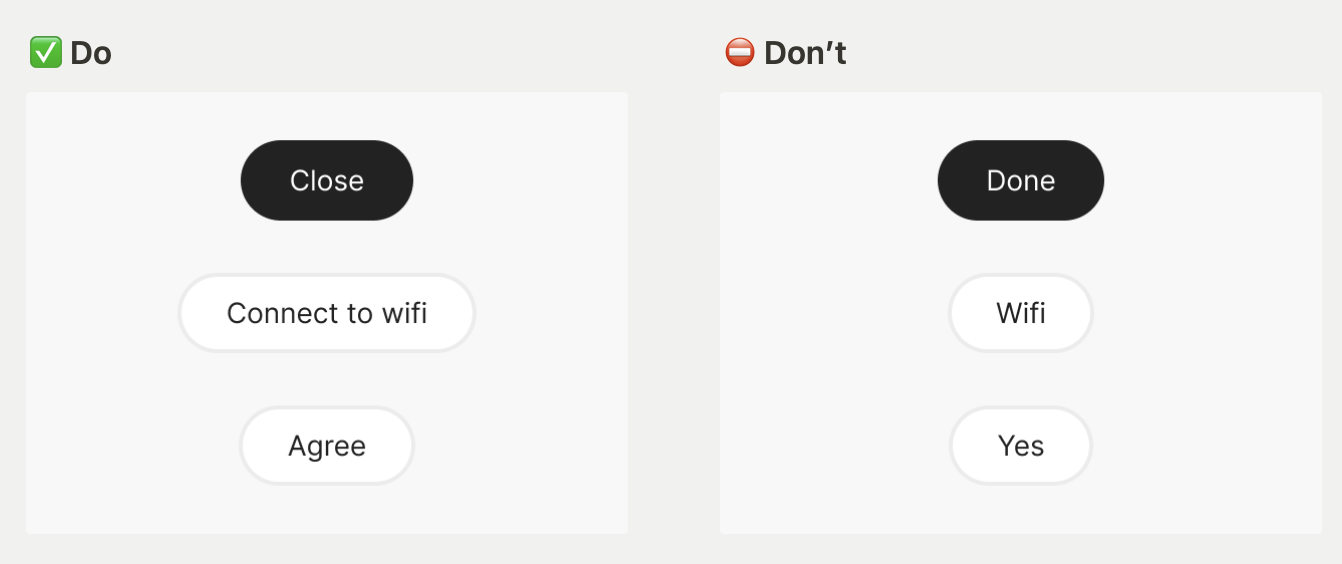
Creating image examples
All images used should be Pleo specific. Ideally, image examples are created using the components in our Figma library. We’ve created a content guidelines Figma file for this exact purpose.
💁 No Figma expert? Feel free to reach out to the Design Systems team.