Components
Components
Presentational user interface components such as buttons, form elements and overlays. Browse all components or select a specific category.
Choose category...
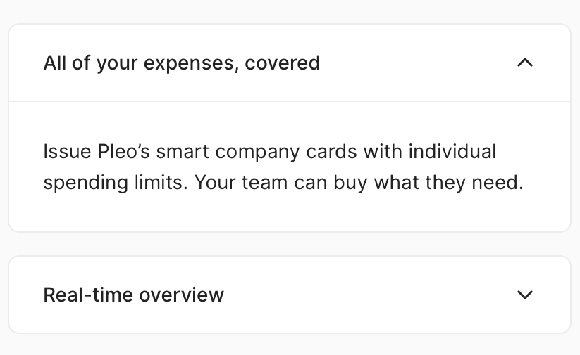
Accordion
A stacked set of interactive items that you can click to show more information. Each item can be either collapsed or expanded to reveal the complete content.
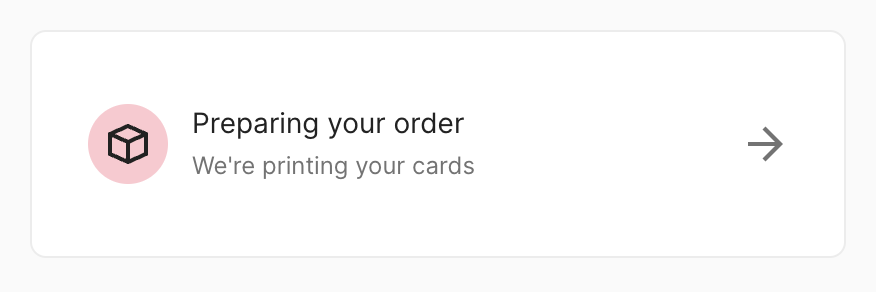
Action banner
A versatile and somewhat unopinionated component. Commonly used as a linkbox to combine multiple elements into a single interactable element.
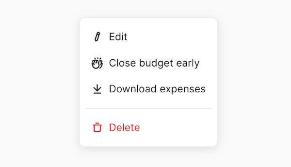
Action Menu
Enable users to trigger actions from a list in a popover when space is limited.

Avatar
A graphical representation of a user or entity - usually a photo or initials

Badge
A static label that highlights an item's status.

Banner
A prominent section at the top of a page that provides users with important feedback or information relating to the entire page, product, or application.

Box
A utility component for working with spacing.

Button
A clickable element which communicates that users can trigger an action.
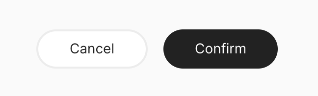
Button group
A layout component used to group multiple related actions a user can take.
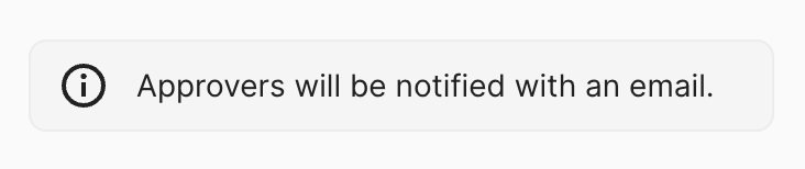
Callout
Capture the attention of users and provide them with important feedback or information that relates to an entire page or page section.
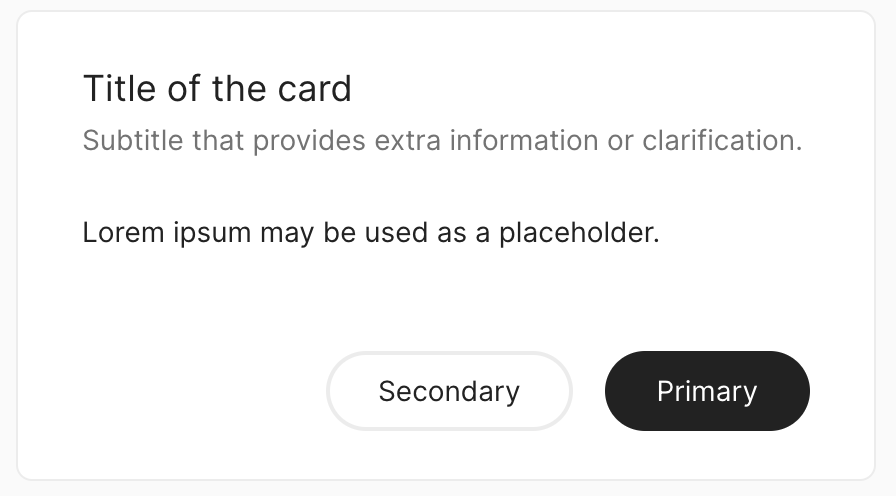
Card
A styled container that groups related content and actions.

Checkbox
A form element that enables users to make a binary choice (checked/unchecked).
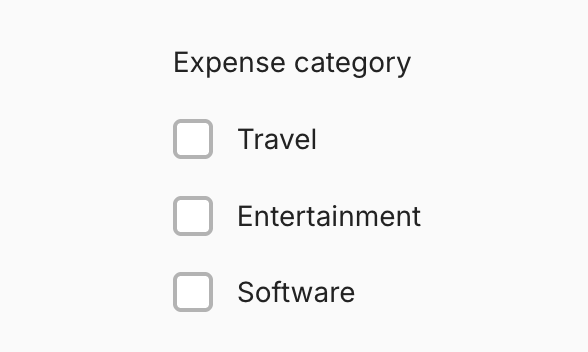
Checkbox group
A form element that enables users to select multiple values from a list of options.

Chip
New: NewA compact, interactive control for suggesting, selecting, or representing an entered value.
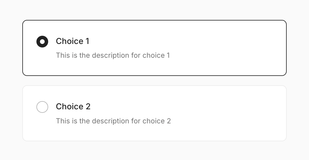
Choice tiles
Enable users to select a single value from a list of choices that support more complex content than regular radio buttons.
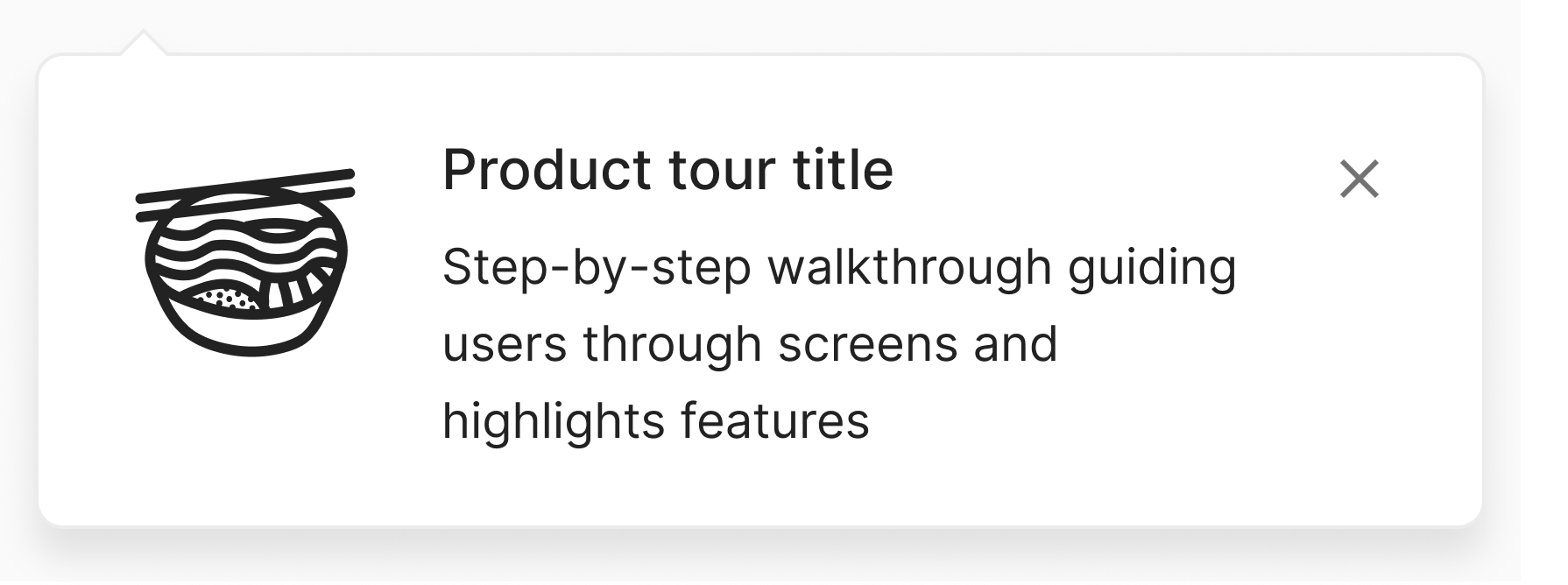
Coach mark
A Popover that guides users step-by-step through key aspects of new features.

Code input
A numeric code input rendered as individual cells, for passcodes, one-time passwords (OTP) and authenticator (TOTP) codes.

Copyable
A button that allow users to quickly and easily copy content to their clipboard.
Count
A static label that indicates the quantity of items.
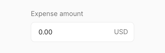
Currency input
An enhanced input field that provides visual and non-visual cues to a user when entering an amount of money in a specified currency.

Data list
Warning: LabA versatile and accessible utility component for rendering lists of data. It provides features such as keyboard navigation, infinite scrolling, and customizable rendering.
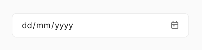
Date input
New: NewEnable users to input a date — either in a textfield or with a date picker.

Date picker
A form element used to select a single or a range of dates.
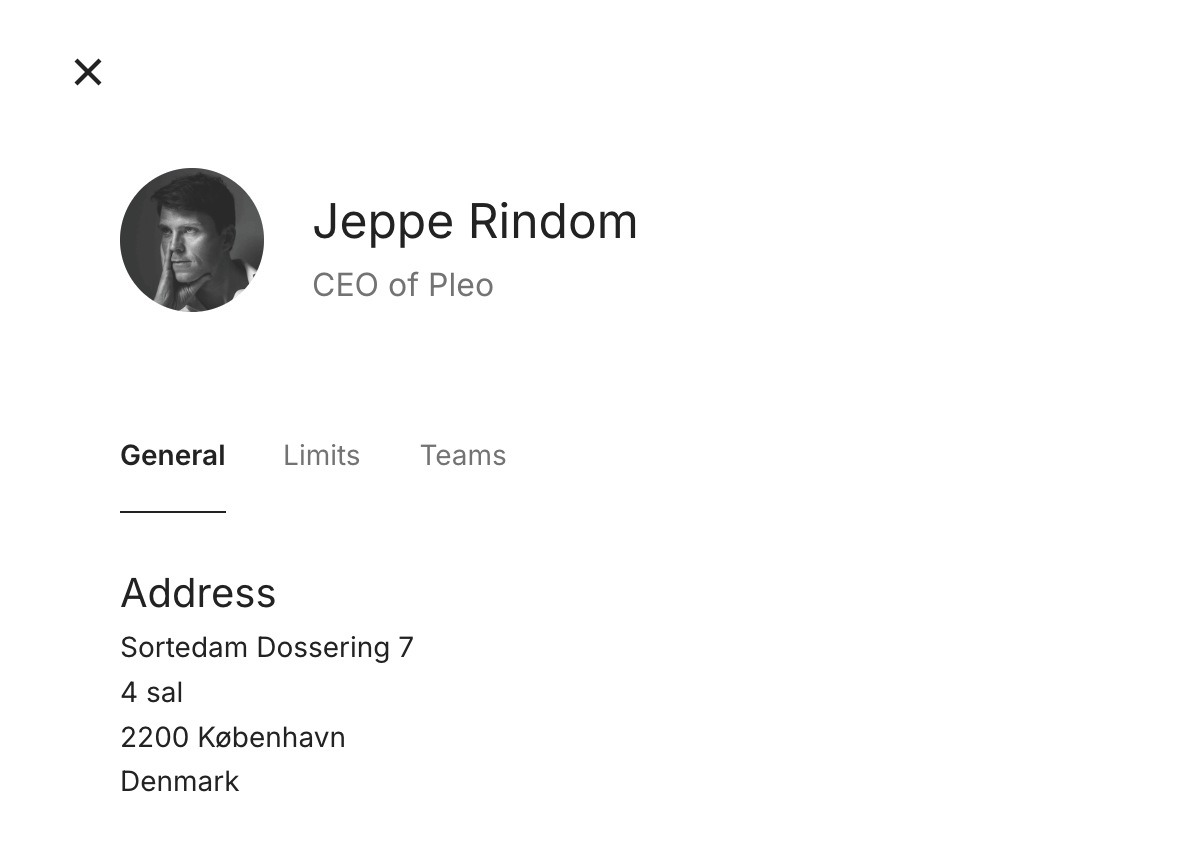
Drawer
A panel that slides out from the edge of the screen to focus a user's attention on completing a task or viewing details about an item.
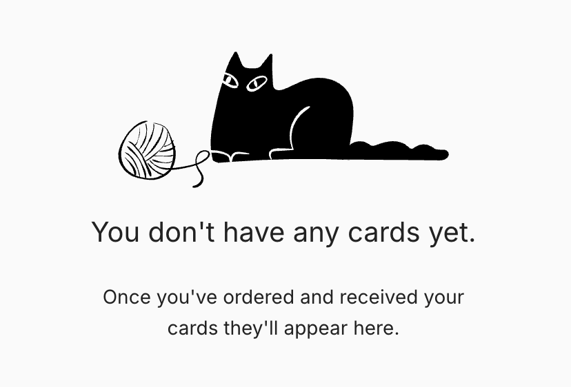
Empty state
Used when there is no data to display to describe what the user can do next. Empty state provides explanation and guidance to help user progress.
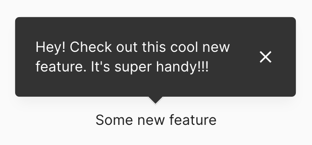
Feature Tip
Used to help users learn about new or unfamiliar interface features.

Fieldset
A wrapper for related form fields. Used to separate form content with a label and spacing.
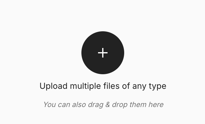
File drop
Utility component that lets users upload files by dragging and dropping the files into an area on a page, or activating a button.

File input
Utility component that allow users to select a file(s) from the file system.
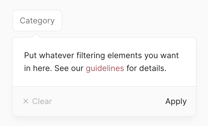
Filter menu
A component used to apply category-specific filters for a dataset.
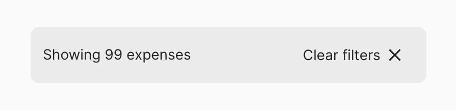
Filter results
Used to reflect the amount of results given a set of applied filters. It's also used to allow users to clear all filters.
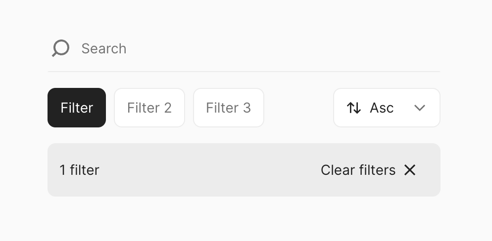
Filters layout
A composable and responsive layout component for filters

Flex
New: NewA utility component for creating flex layouts

Footer
New: NewA footer bar for actions, pinned to the bottom of a page or panel.
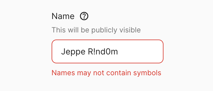
Form control
Form control displays a labelled input and, optionally, associated validation text, help popover, and/or hint text.
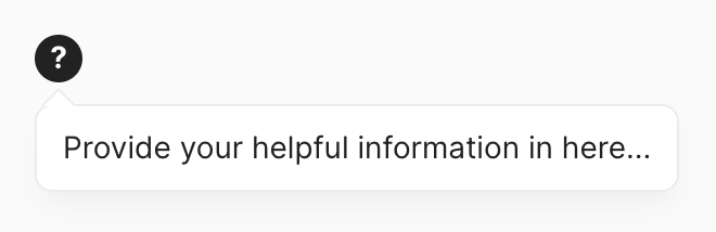
Help popover
An icon button with a question mark that reveals help information on click or tap.

Icon button
Enables users to control the visibility of other UI elements.

Inline
A utility component for controlling horizontal layouts.
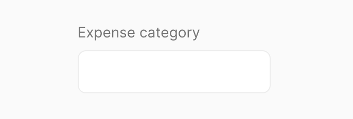
Input
A form element that enables users to enter a single line of text.

Link
Text that navigates the user from one page to another.
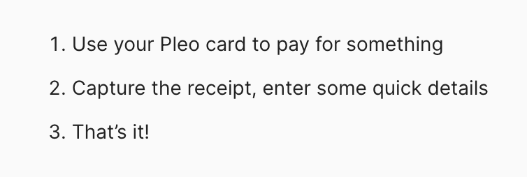
List
A set of text objects in a bulleted or numbered format.

List item
A versatile element that can display information in a clear and organized manner.
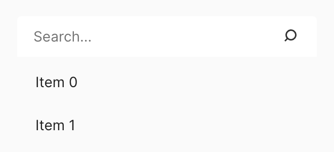
Listbox
A listbox provides a way to select or reorder options in a predefined list and a selected option can then be made to perform a single action.

Loading
A component used as a placeholder when content is not yet available or to indicate that an action is being processed.
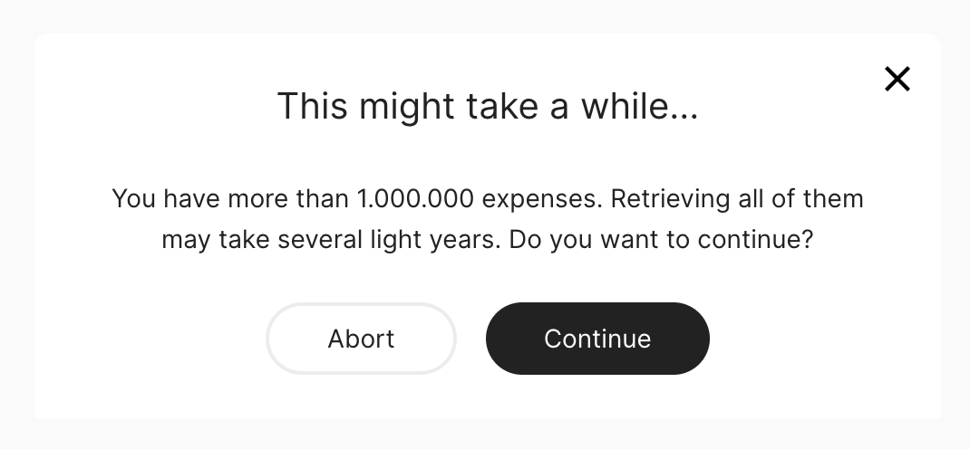
Modal
A page overlay that displays information and blocks interaction with the page until an action is taken or the modal is dismissed.
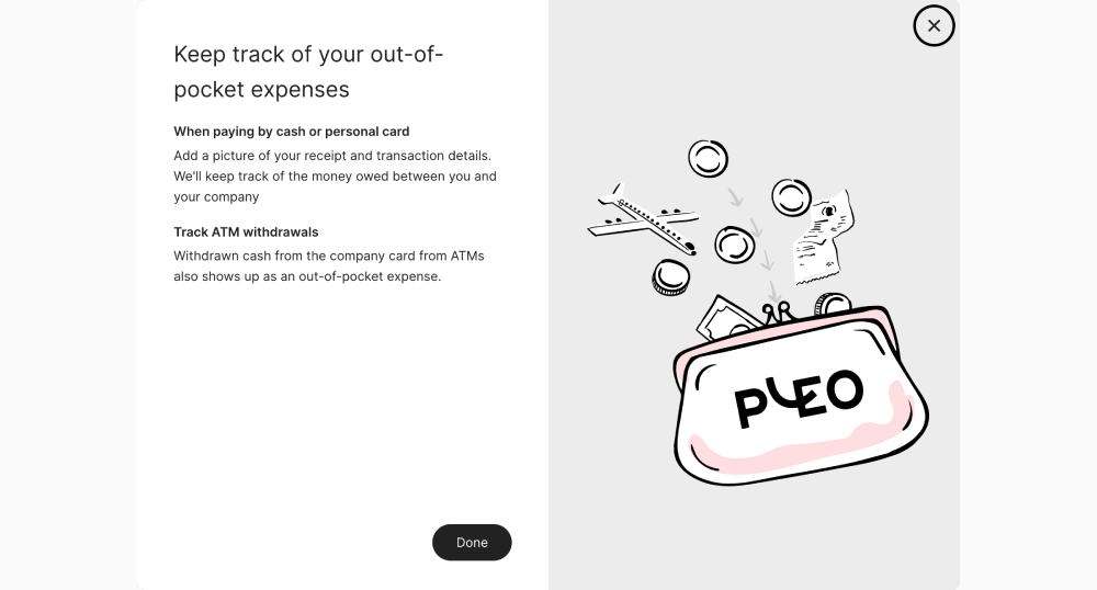
Modal Split
Modal split is a focused-experience, introduced as an overlay to explain to customers concepts or actions within the product.
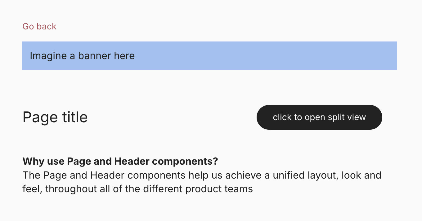
Page
Information: A collection of components which let you compose a page in our web application.

Phone input
Warning: LabUsed to collect phone numbers with international dial codes. It contains a dropdown which allows the user to choose from a list of countries and dial codes.

Pleo logo
The horizontal Pleo wordmark, drawn as an inline SVG in the brand logo colour.
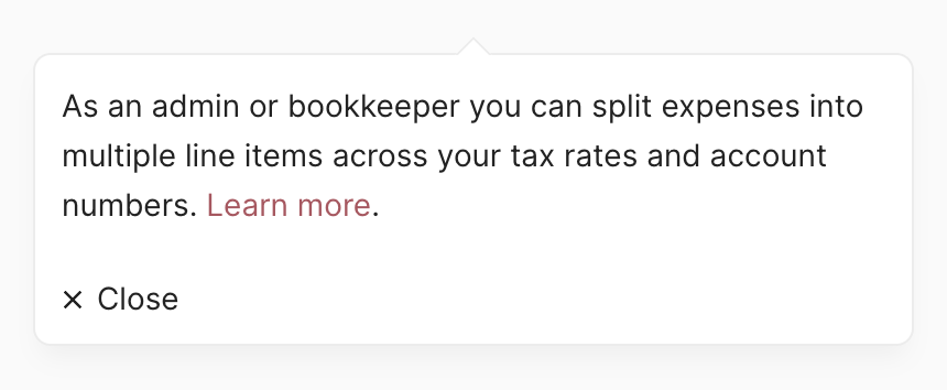
Popover
A small overlay that opens on demand. Popovers allow users to access additional content and actions without cluttering the page.

Progress bar
A component used to represent the completion of a task or to visualize different states that are relevant to the user.
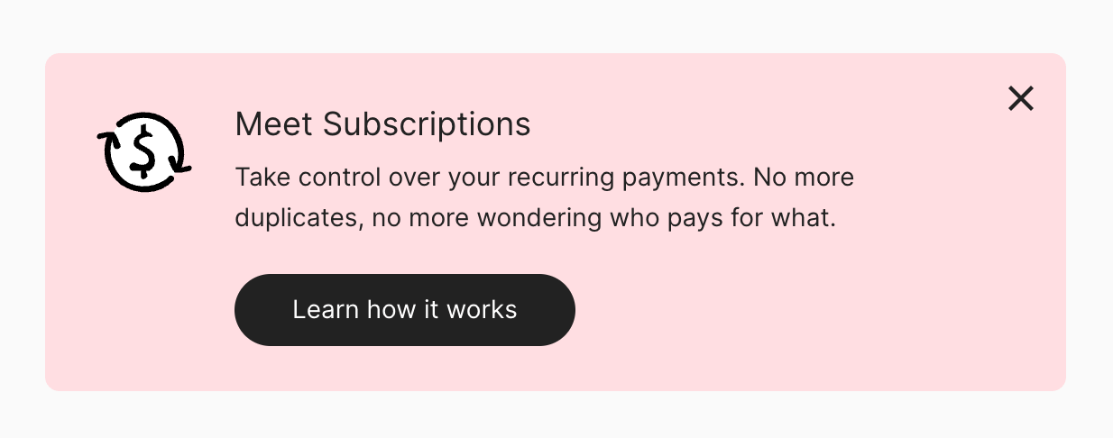
Promotional Banner
Displays an important, succinct, promotional message, and provides actions for users to address (or dismiss the banner). It requires a user action to be dismissed.

Radio group
A form element that enables users to select a single value from a list of options.

Search
An input that allow users to find content by entering a search term.
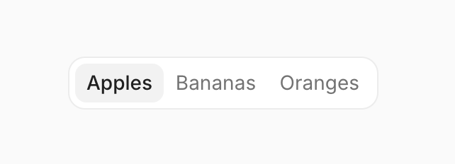
Segmented control
A hybrid somewhere between a button group, radio buttons, and tabs; segmented controls are used to switch between different options or views.
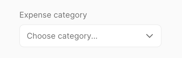
Select
A form element that enables users to select a single or multiple values from a list of options.

Skeleton
Replaces content with a placeholder of the same shape to indicate a loading state.

Slider
A form control for choosing a value within a preset range of values.
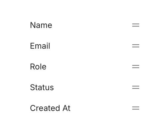
Sortable List
A component that lets users customize the order of list items.

Spinner
A component used as a placeholder when content is not yet available or to indicate that an action is being processed.

Stack
A utility component for controlling vertical layouts.

Steps
An interactive representation of a user’s progress through a series of discrete steps, with the Wizard component as its non-interactive counterpart.

Suggestion bar
A list of buttons shown below an input field that when clicked updates the input value
Switch
A control used to switch between two states - often on or off.
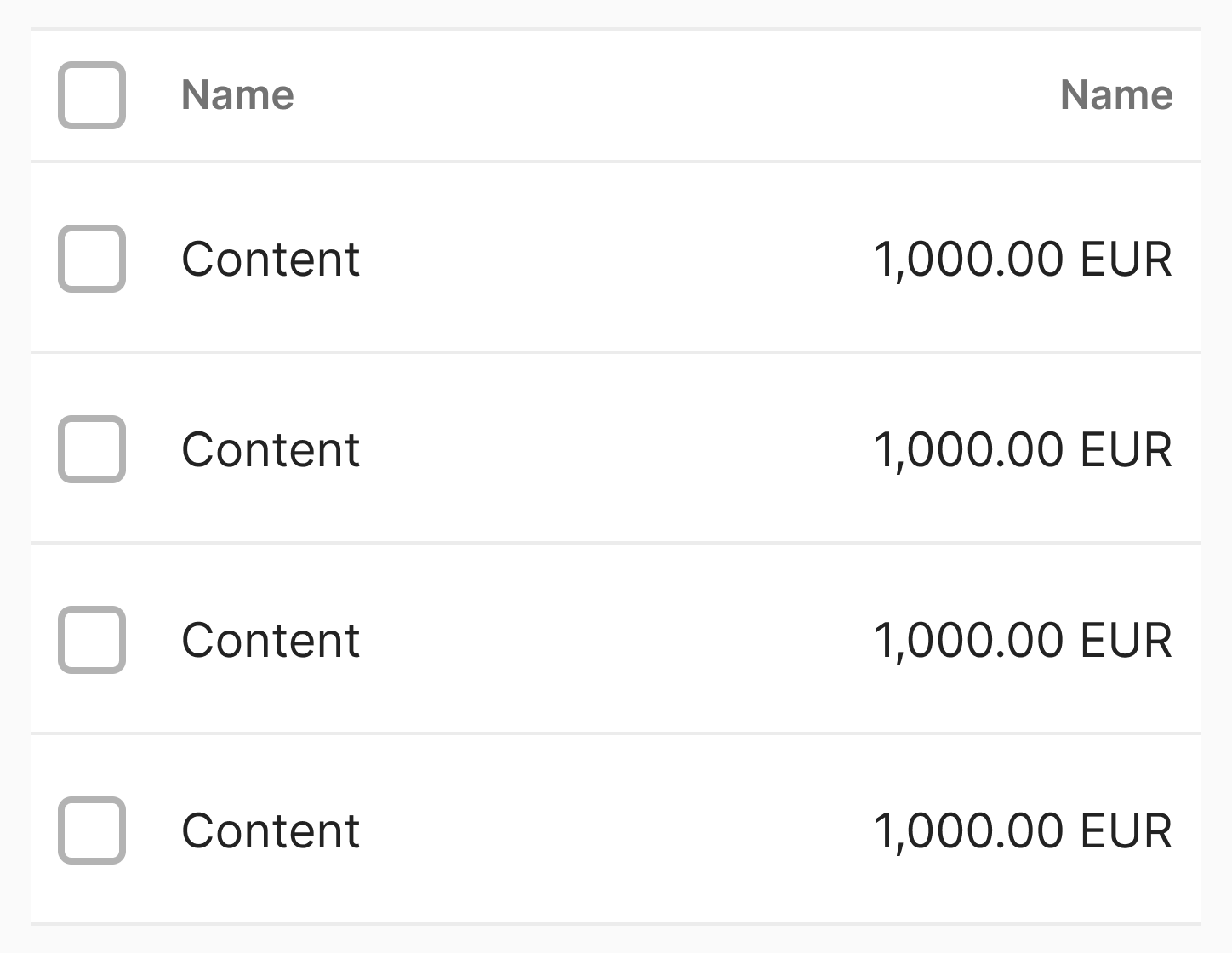
Table
A component for displaying large amounts of data in rows and columns.

Tabs
Tabs are labeled controls that allow users to switch between multiple views within a page.
Tag
A static label that highlights an item's category or attribute.
Text
A primitive component that can be used to create all kinds of text styles.
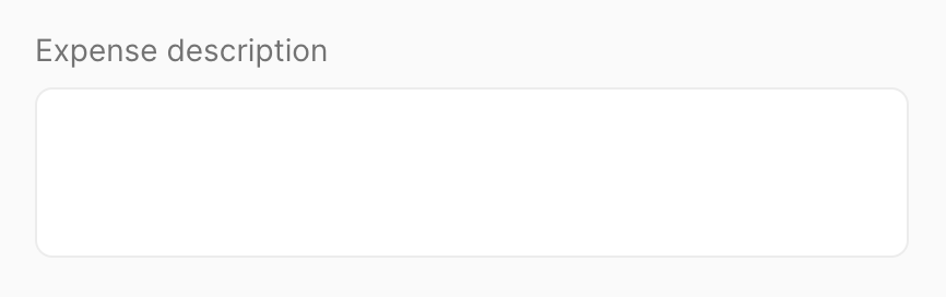
Textarea
A form element that enables users to enter text on multiple lines.
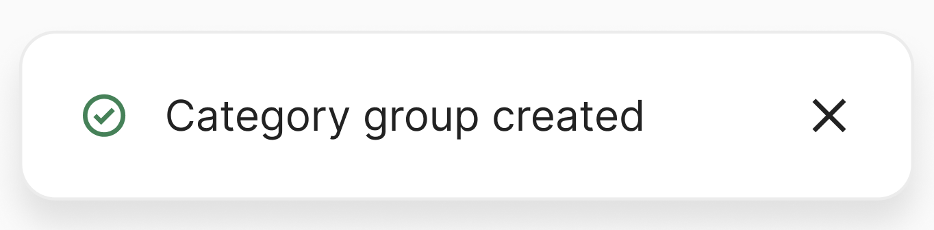
Toast
Give users short, non-disruptive feedback on the outcome of an action.

Tooltip
A popup that displays information related to an element when the element receives keyboard focus or the mouse hovers over it.
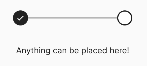
Wizard
A non-interactive representation of a user’s progress through a series of discrete steps, with the Steps component as its interactive counterpart.