See Filter menu and Filter results components for implementation details.
Introduction
User research shows that people really appreciate the ability to narrow down search results. When well-designed, filters create a positive feeling of control and choice, especially in the face of overwhelming numbers of options.
To make filtering useful, we try to develop filter categories and filter values that are appropriate, predictable, jargon free, and prioritised. We keep filtering elements within dropdown menus in a filter bar to avoid cluttering the UI.
Ordering and layout
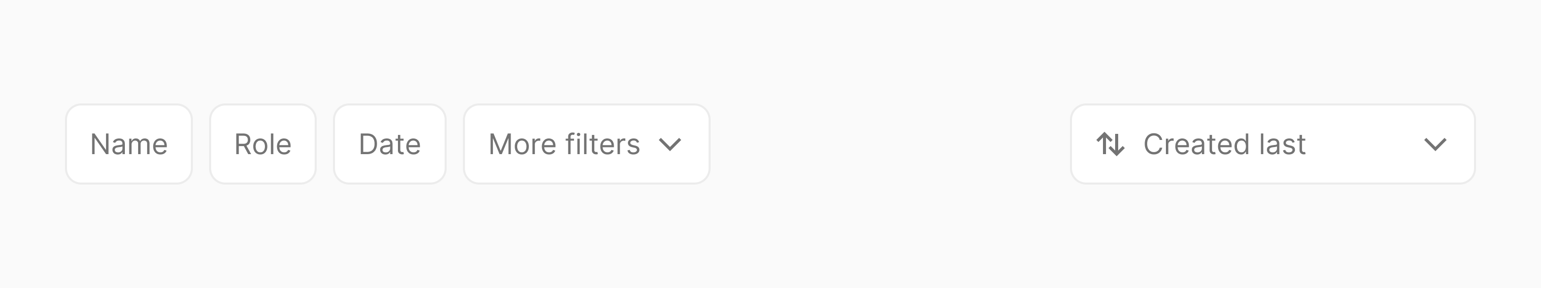
Filters should be ordered from left to right in terms of importance. If the amount of filtering categories doesn't fit within the horizontal space we keep additional filters within a “More filters” menu as the last item.
If your layout includes a sorting option, this will sit on the far right hand side of the filters. If your layout includes search this should will appear to the left of the filters.
The layout of filter components will change depending on the space available. When the sort element reaches the last filter button the search bar will change from fixed width to full width and the filter buttons and sort element will be relocated below the search bar.
See our Filters layout component for implementation details.
Applying and clearing individual filters
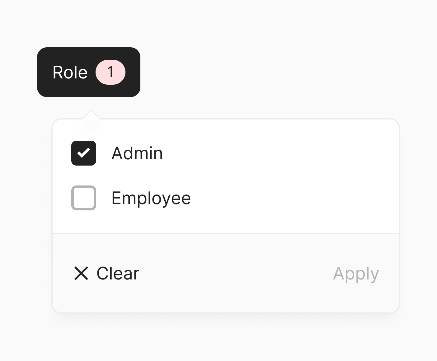
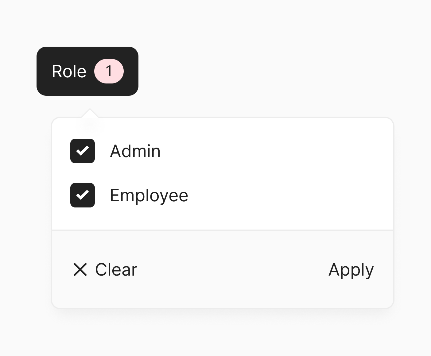
We don't apply filters instantly (e.g. when a checkbox is toggled on/off). We apply filters when the "Apply" button within a filter menu is clicked or the filter menu is closed. On a per-filter menu basis. We find this balance between interactive filtering and batch filtering to work well for our product.
Within filter menus, we always have "Clear" and "Apply" actions visible. But we keep them disabled when they're not applicable to make it clear if the interim filters match those applied.
Clear
The "Clear" action should be enabled whenever interim filters are used.
Apply
The "Apply" action should be enabled when interim filters deviate from applied filters.
Indicating that filters are applied
When filters are applied, this should be reflected in the "toggle" button. We do so by changing the background color of the button and purposefully adjusting the content within it.
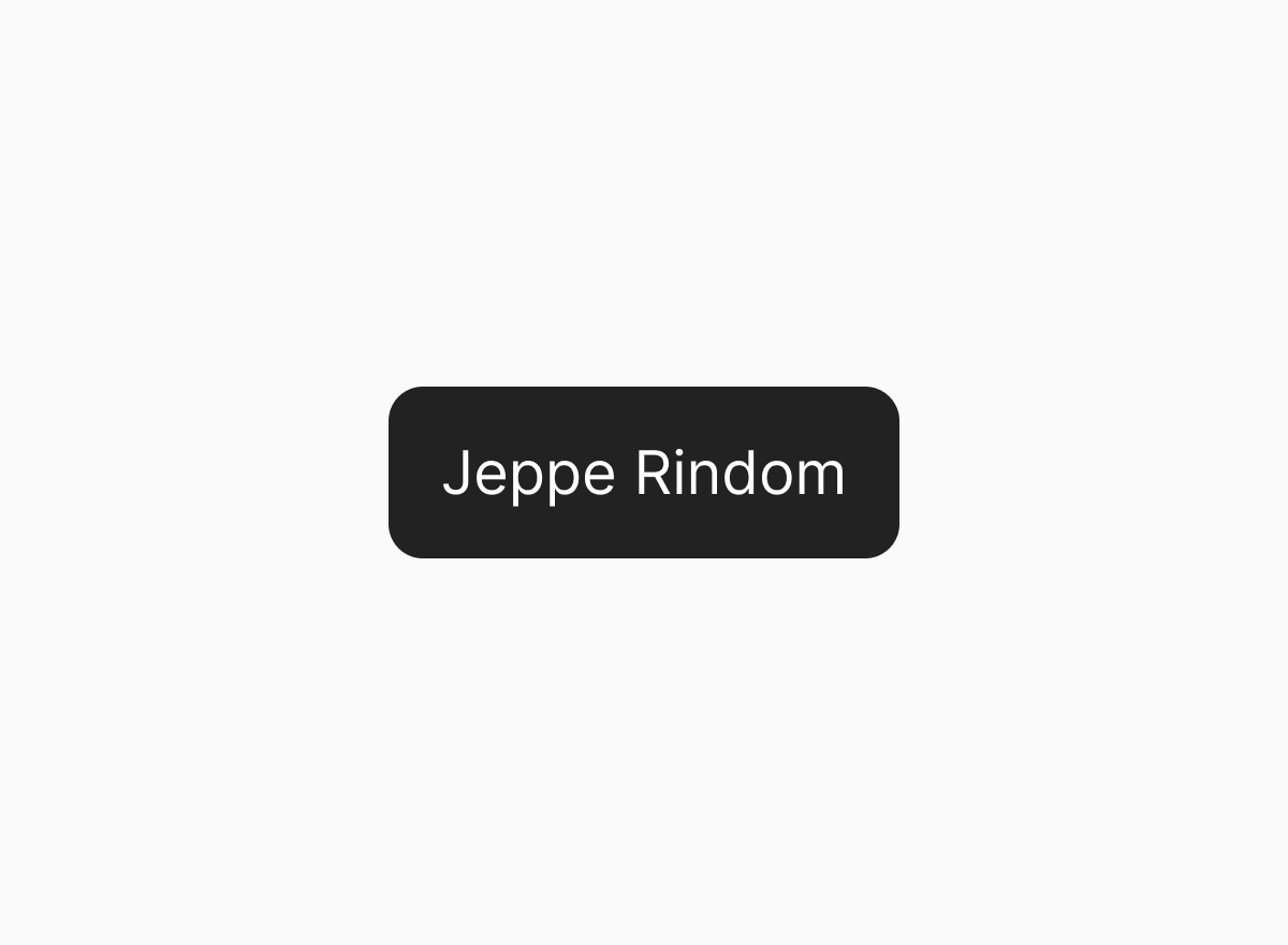
Single select
When only a single value can be applied at a time, we replace the filter category with the applied value:
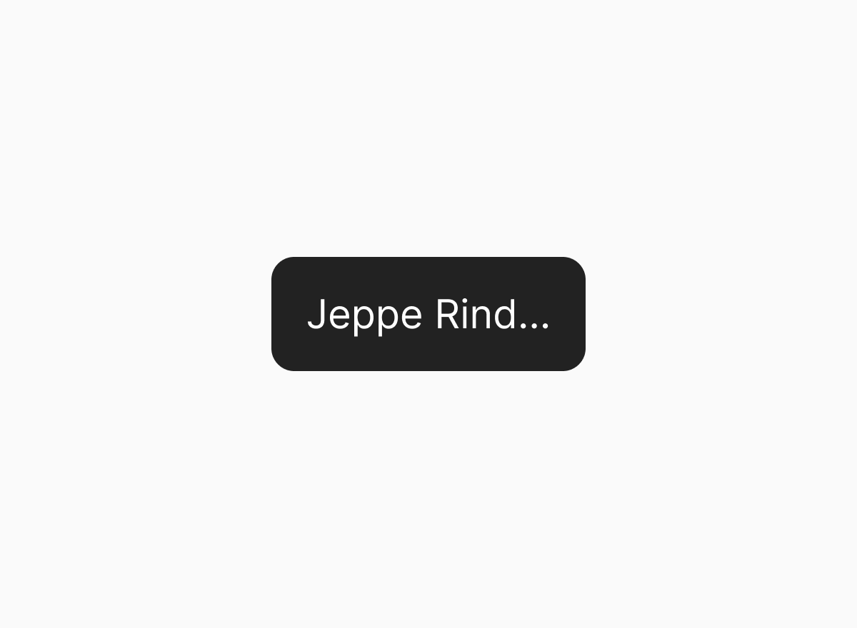
Ellipsis text
If there are many filter categories and limited horizontal space, we use ellipsis text.
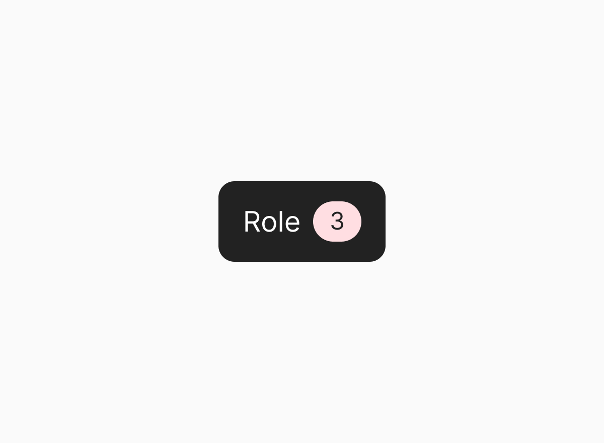
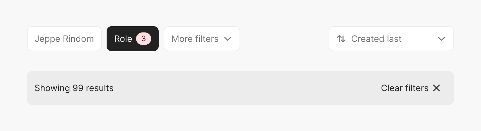
Multi select
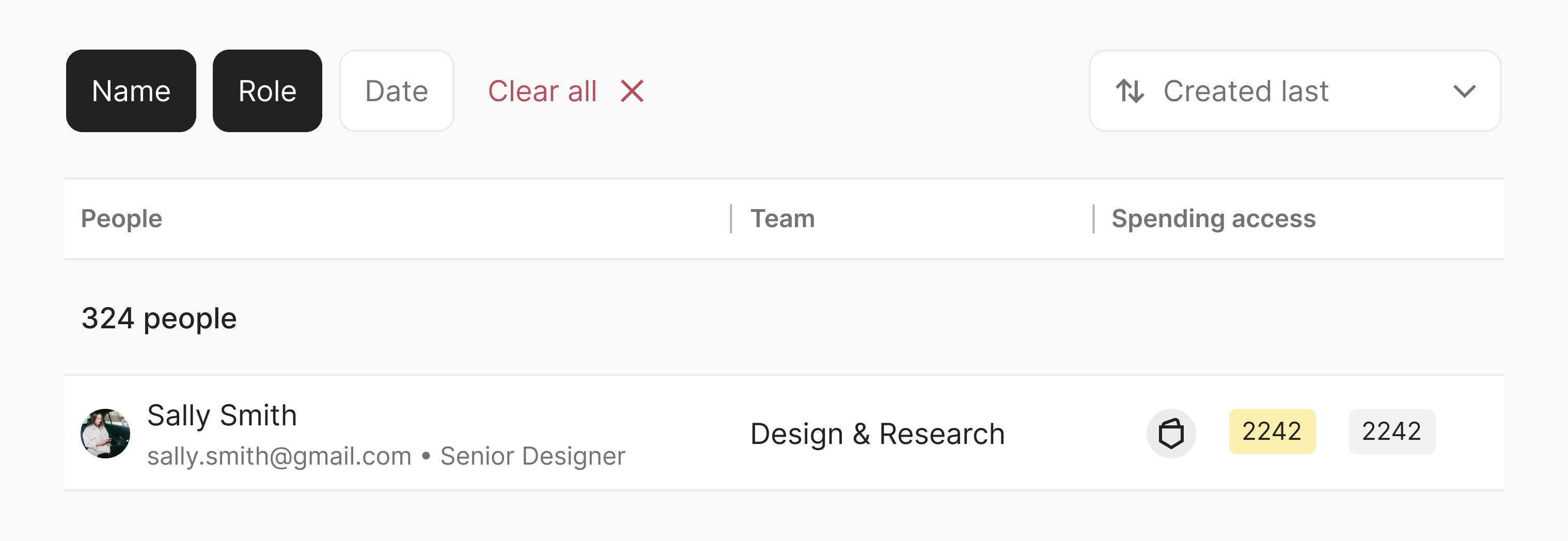
When multiple values can be applied, we display a "count" next to the filter category indicating the number of applied filters.
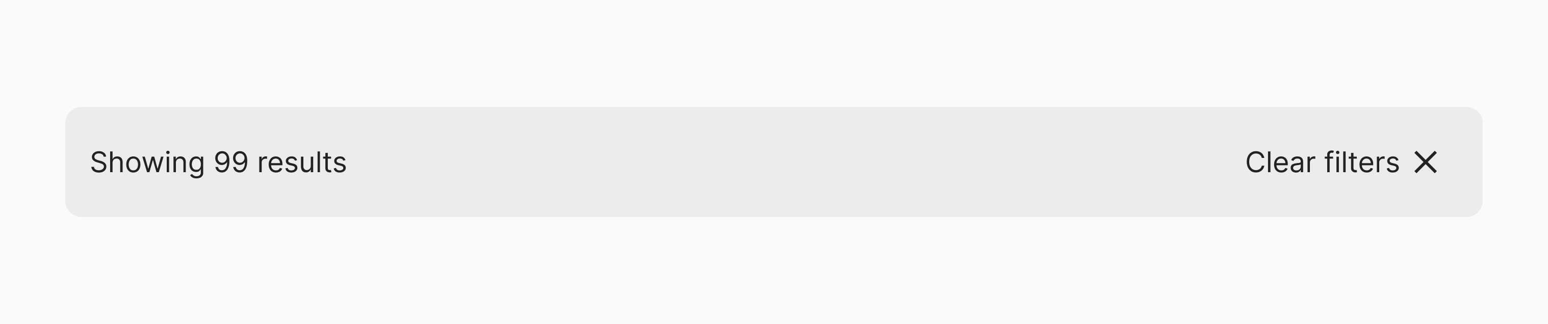
We also show a "results" bar to communicate the number of items matching the currently applied filters. This component also presents the user with an easy way to clear all filters.
Clearing filters in table views
When filters are applied to a table view, we often reflect the items matching the applied filter in the table header. In this case, instead of a “results” bar, use a “clear all” link next to the filters to clear all filters.
Loading
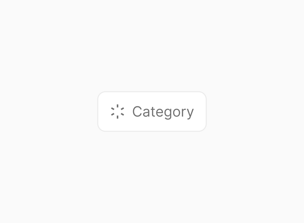
When applied filters are being fetched, we sometimes render the filter toggle in a loading state. The loading state should only be used if the process of fetching the applied filters may take a while.
Persisting filters in the URL
We always persist applied filters in the URL. This a common practice on the web (consider sites such airbnb, amazon or zalando). This practice allow users to share or bookmark pages in a certain state and if clicking a list item navigates the user to another page, they can navigate back and have the same filters applied.
References
- Defining Helpful Filter Categories and Values for Better UX
- Mastery, Mystery, and Misery: The Ideologies of Web Design
- User Intent Affects Filter Design
Looking for more guidelines on this topic? Check out our curated list of resources.