Check out our brand system to explore the principles and stylistic choices behind our illustrations, including how they align with our brand’s visual direction and personality.
Low complexity
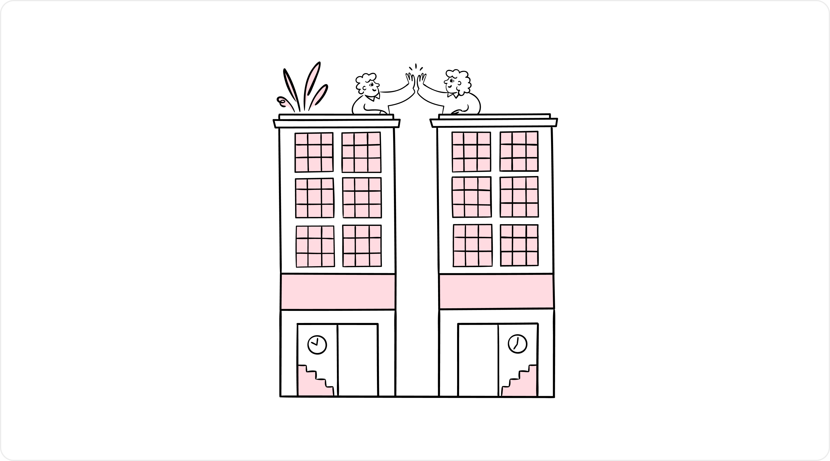
Low complexity illustrations distill message to a simple visual, directing users’ attention and bringing delightful accents to our product. They support copy, but are not intended to replace or substitute it, as we avoid building multi-levelled rebuses.
These illustrations are best suited for smaller interface elements like an Empty State. Their minimum dimensions are 320px by 280px. For even smaller containers, like a Card, use a Pictogram instead.

High complexity
Even our high complexity illustrations aim for simplicity of form and clever ideas. Intended to support copy through visual narratives, our detailed illustrations leverage brand, explain our product, and bring life to the story we’re painting.
These illustrations are intended for larger layouts such as onboarding flows, sign-up experiences, or Modal Splits, where they serve an educational role. They have a minimum width and height of 320px and should not be scaled down for use in smaller spaces meant for low complexity illustrations.

High complexity with UI
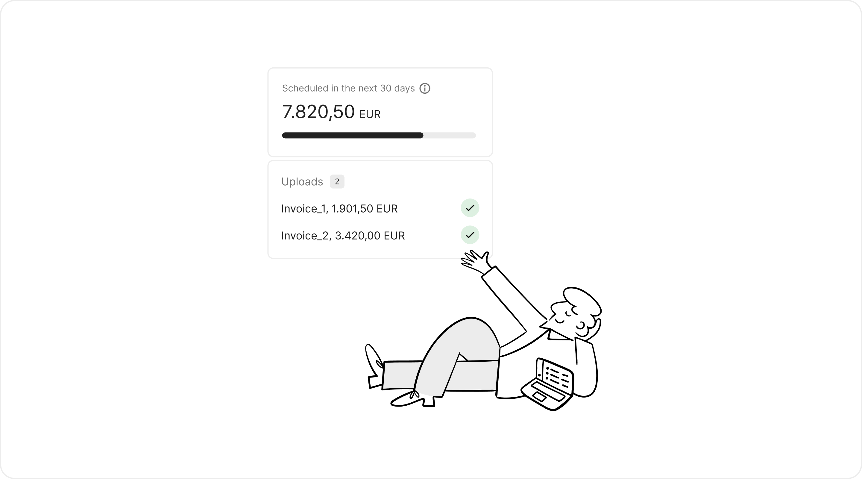
A subset of our high complexity illustrations feature simplified UI to represent our product. We avoid drawing Pleo software – it is important we leverage our great product in a realistic, trust-evoking manner where we can. In this context, illustration plays a secondary role, highlighting desired sections and adding the brand spark.
When crafting simplified UI, we aim for a sweet spot between limiting information to direct attention and maintaining a clear visual connection to the actual product. Layout and typography are adapted for legibility in their destination.
Use these illustrations to explain Pleo features in components like Modal Split.
