Introduction
Status types define how the system communicates different kinds of messages. Each status type comes with a primary use case, icon, and set of semantic colour tokens.
This visual language is shared across Telescope’s feedback and status related components and helps users quickly understand a message’s meaning and respond accordingly. Use the icons and semantic tokens outlined below when none of Telescope’s components are a good fit and you need to create something custom.
Use cases
| Status | Use case |
|---|---|
| Neutral | Inform users of something that is useful, but of low importance |
| Info | Highlight important information without implying positivity or risk |
| Positive | Inform users that a desired outcome has been achieved |
| Warning | Inform users that an undesirable outcome is at risk of occurring |
| Negative | Inform users that an undesirable outcome has occurred |
| Discover | Highlight new features to drive adoption |
Neutral
Inform users of something that is useful, but of low importance.
| Icon | Info |
|---|---|
| Background | colorBackground``Neutral |
| Border | colorBorderNeutral |
| Text and icons | colorContentNeutral |
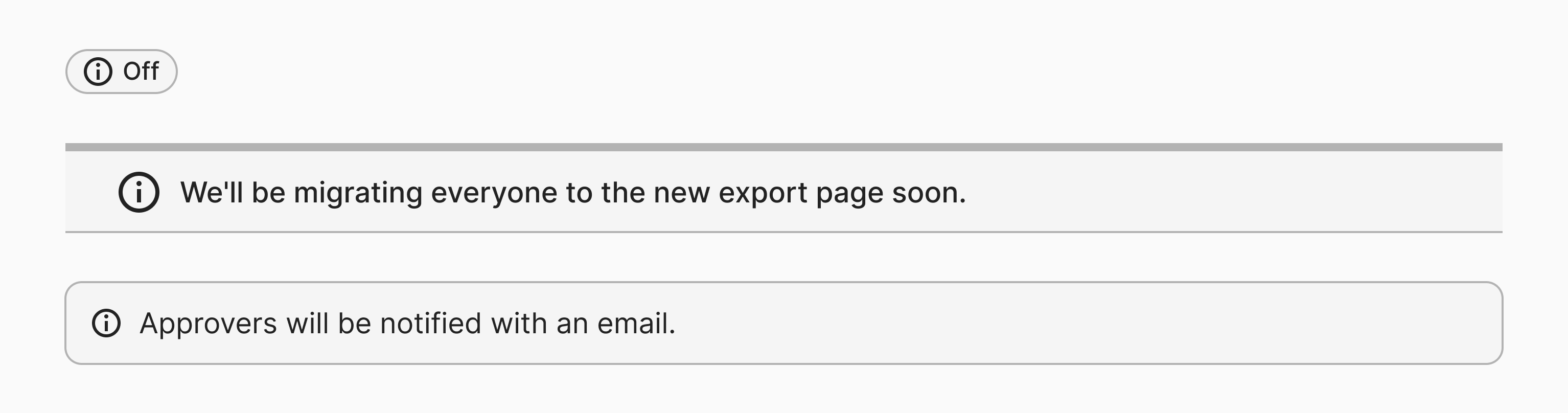
Info
Highlight important information without implying positivity or risk.
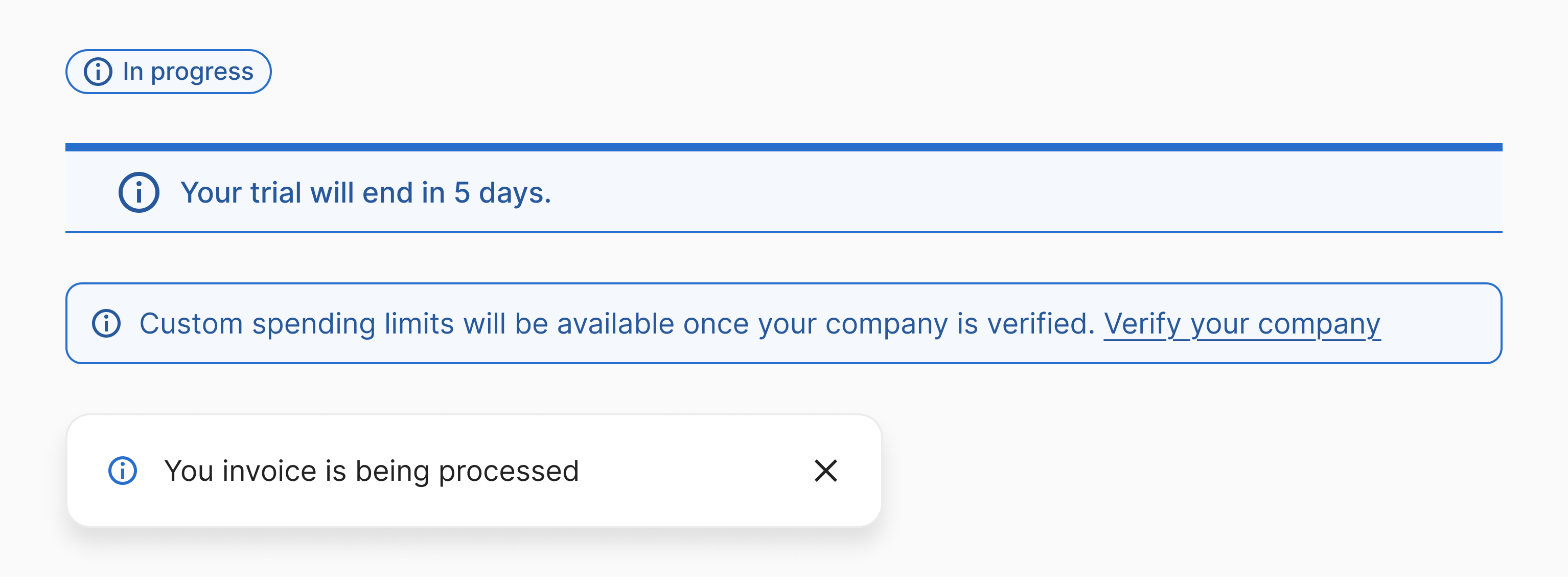
| Icon | Info |
|---|---|
| Background | colorBackgroundInfo or colorBackgroundInfoQuiet |
| Border | colorBorderInfo |
| Text and icons | colorContentInfo (default) or colorContentInfoLoud (on top ofcolorBackgroundInfoQuiet) |
Positive
Inform users that a desired outcome has been achieved.
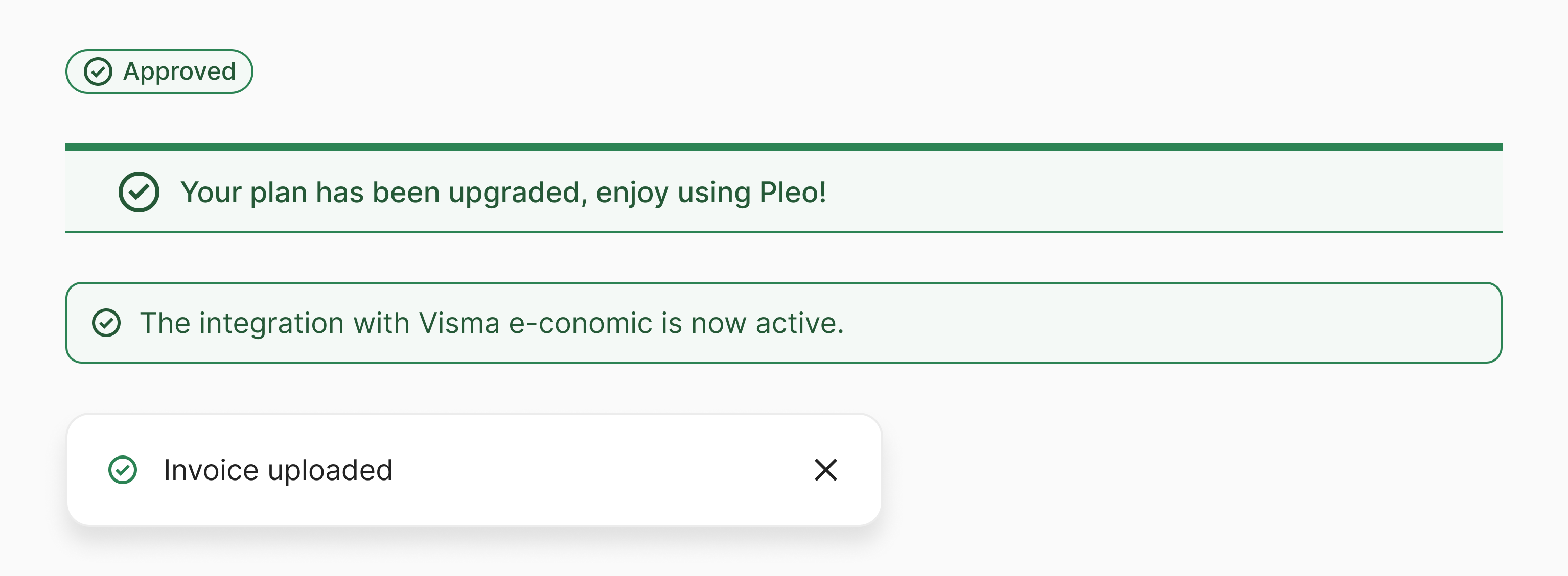
| Icon | CircleCheck |
|---|---|
| Background | colorBackgroundPositive or colorBackgroundPositiveQuiet |
| Border | colorBorderPositive |
| Text and icons | colorContentPositive (default) or colorContentPositiveLoud (on top ofcolorBackgroundPositiveQuiet) |
Warning
Inform users that an undesirable outcome is at risk of occurring.
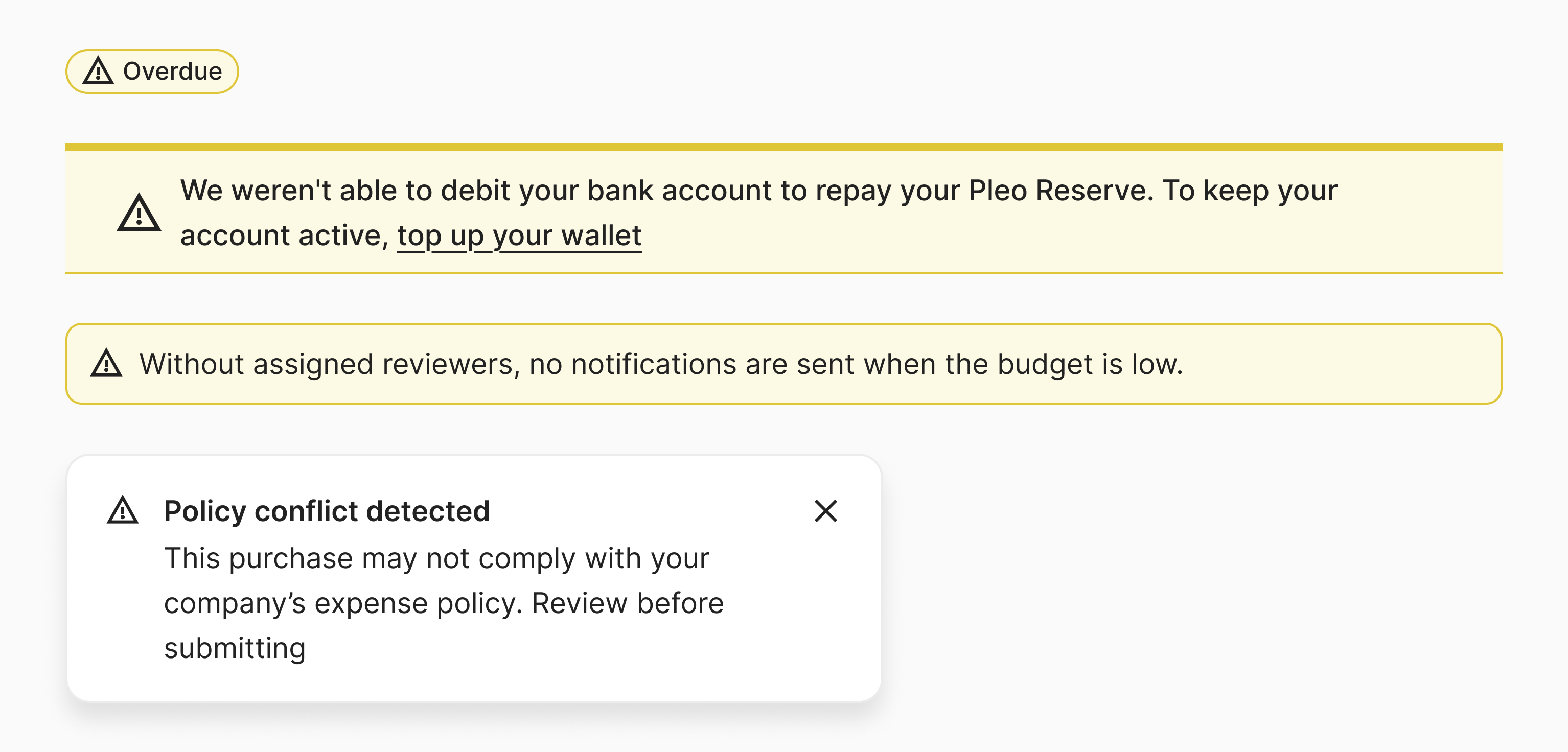
| Icon | Warning |
|---|---|
| Background | colorBackgroundWarning or colorBackgroundWarningQuiet |
| Border | colorBorderWarning |
| Text and icons | colorContentWarning (default) or colorContentWarningLoud (on top ofcolorBackgroundWarningQuiet) |
Negative
Inform users that an undesirable outcome has occurred.
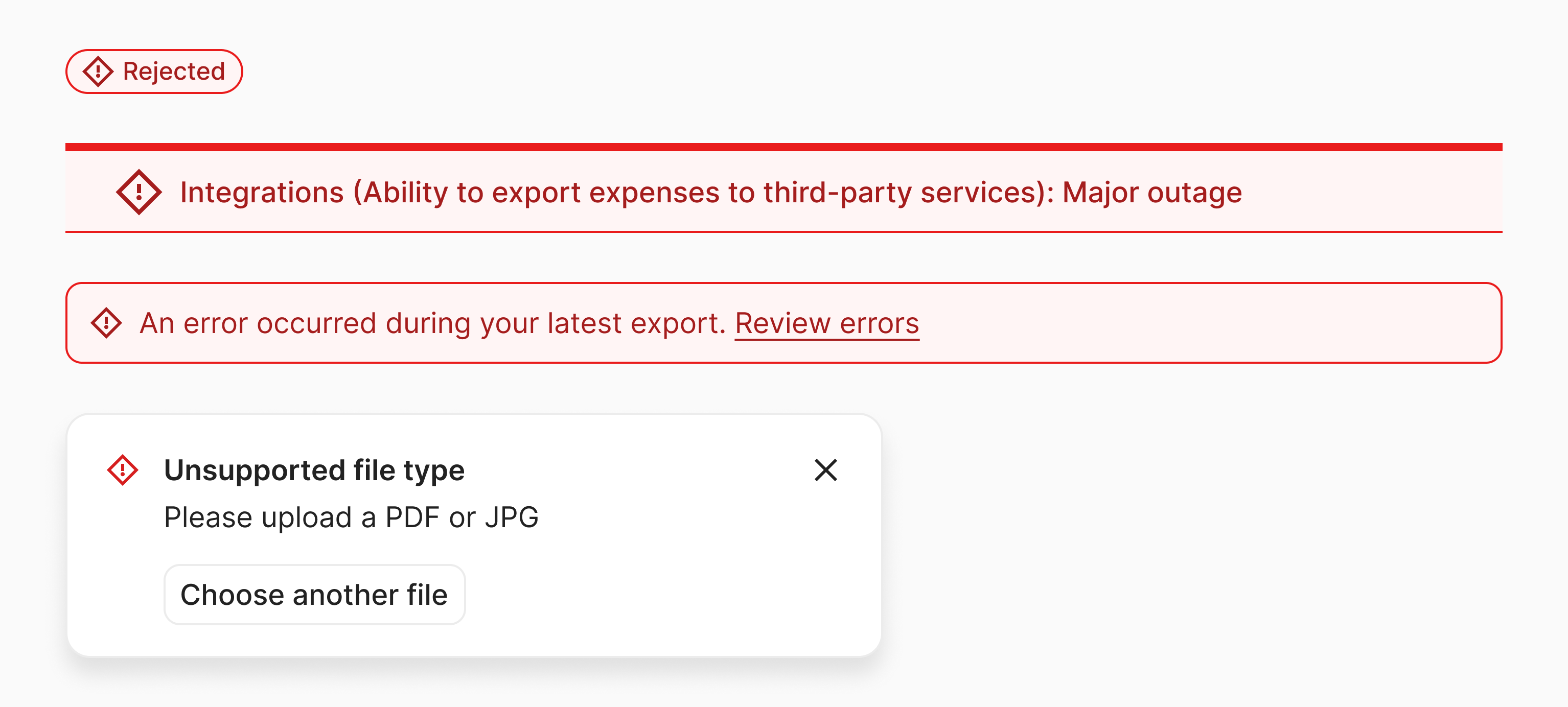
| Icon | Negative |
|---|---|
| Background | colorBackgroundNegative or colorBackgroundNegativeQuiet |
| Border | colorBorderNegative |
| Text and icons | colorContentNegative (default) or colorContentNegativeLoud (on top ofcolorBackgroundNegativeQuiet) |
Discover
Highlight new features to drive adoption.
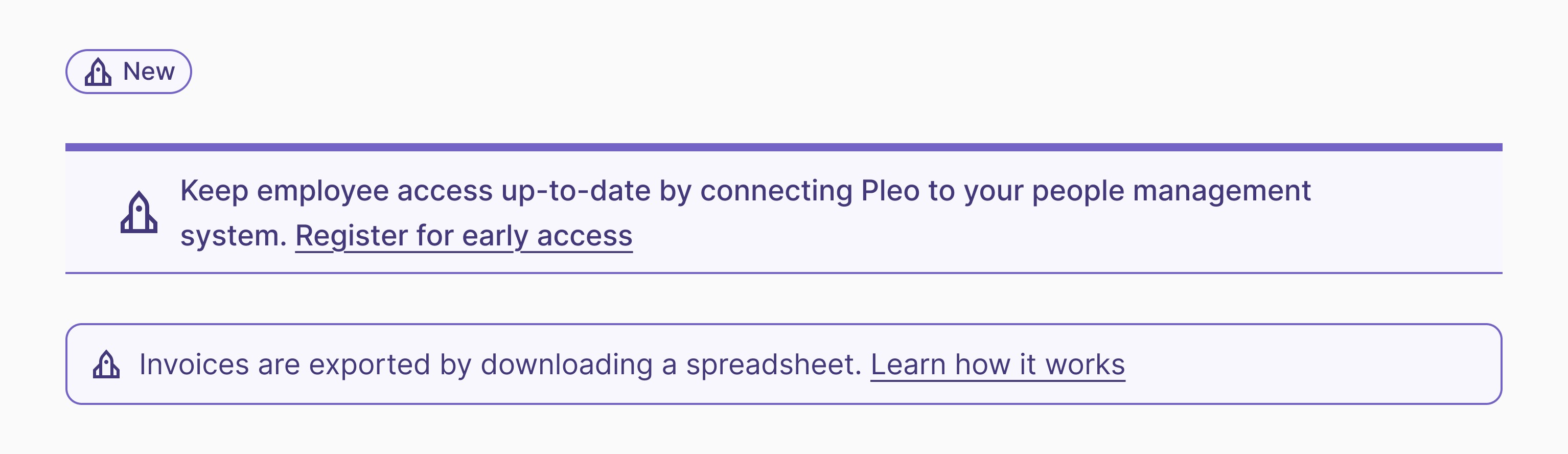
| Icon | Rocket |
|---|---|
| Background | colorBackgroundDiscover or colorBackgroundDiscoverQuiet |
| Border | colorBorderDiscover |
| Text and icons | colorContentDiscover (default) or colorContentDiscoverLoud (on top of colorBackgroundDiscoverQuiet) |