What are design tokens?
Design tokens are the smallest building blocks of our design system. They are name and value pairs that represent design decisions. These decisions concern visual attributes such as color, spacing, typography, animation, etc.
Collectively, our design tokens form a design language that is systematic, cohesive, and tied to our brand. We use our design tokens to construct the components that make up Telescope and product experiences for web and mobile.
What types of design tokens do we use?
Core tokens
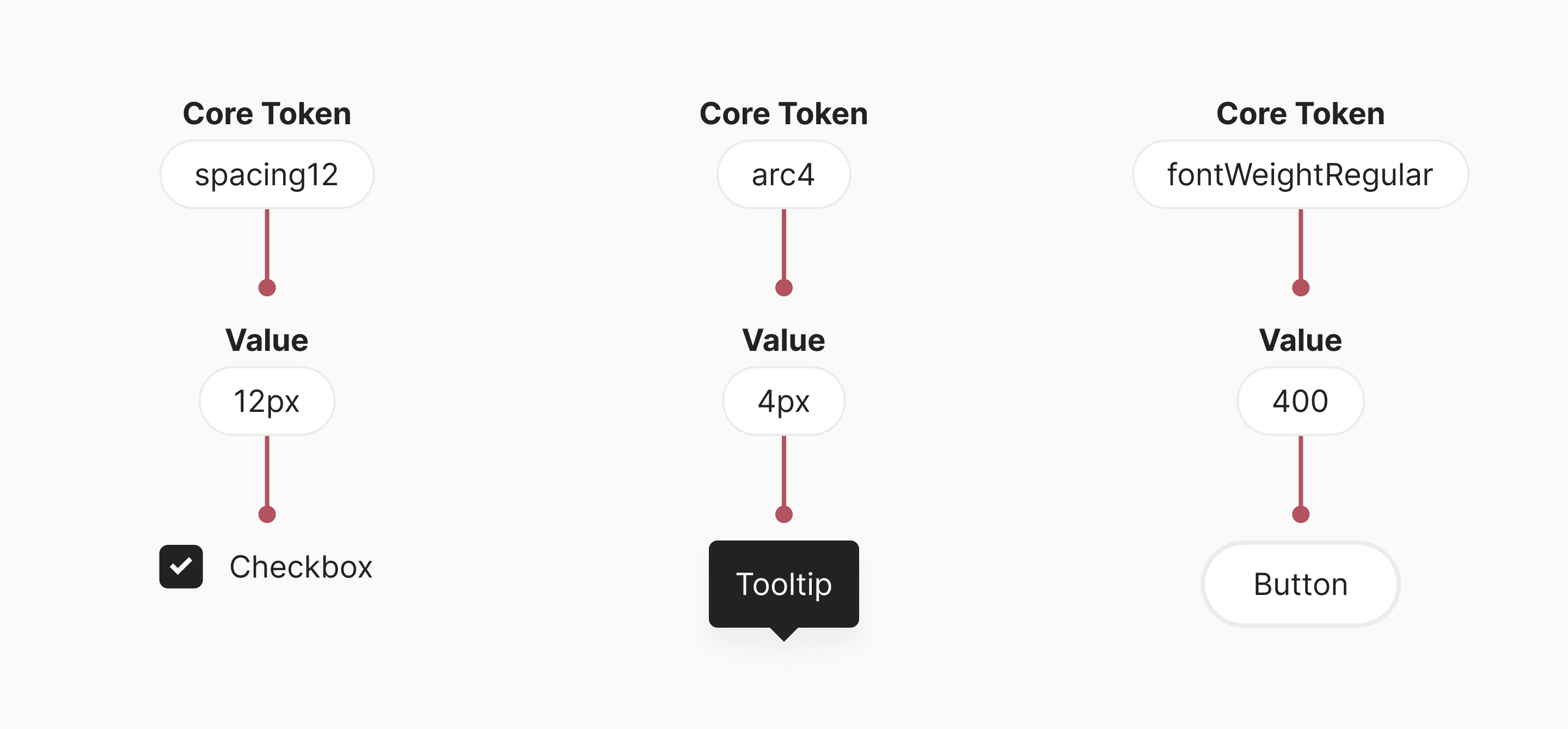
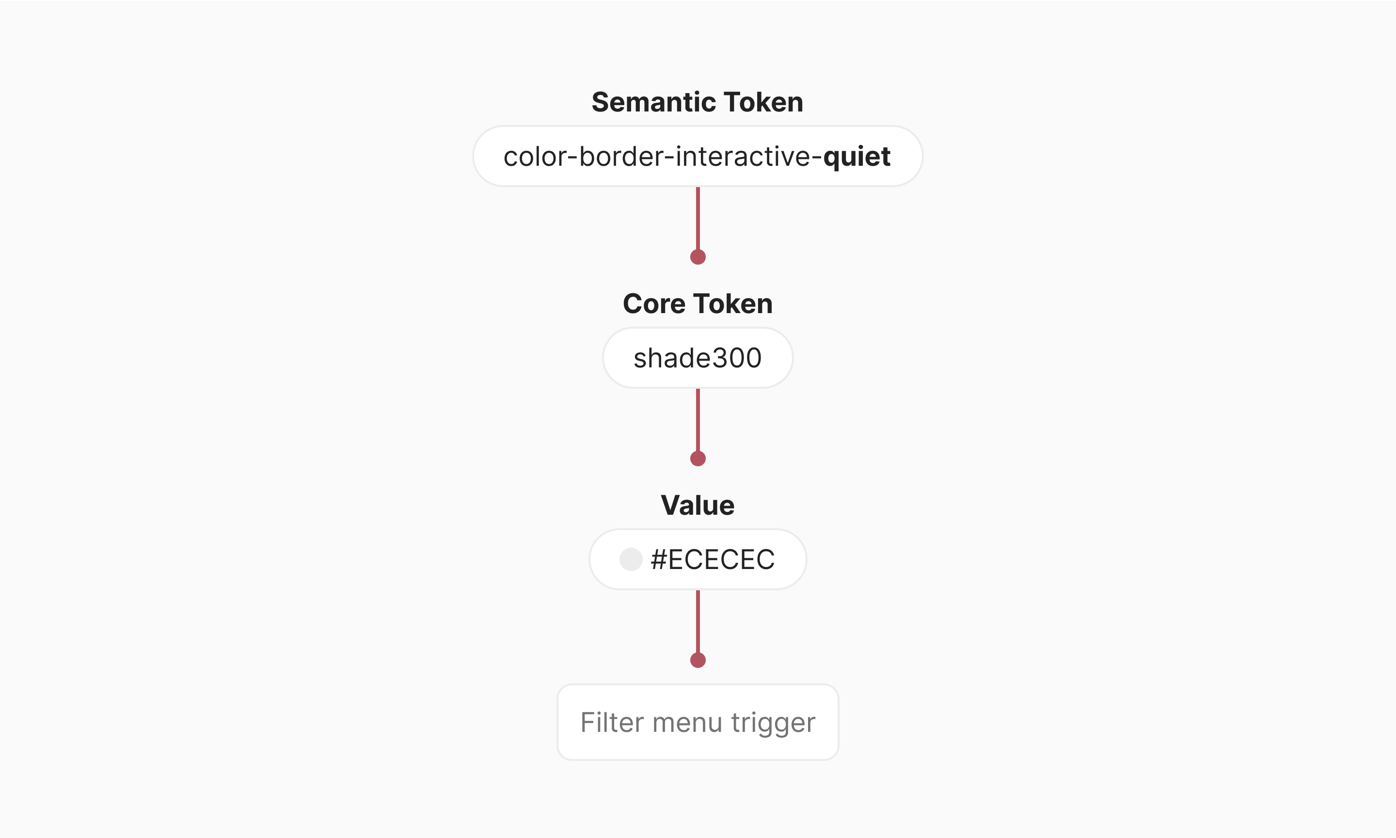
Core tokens are the primitive values in our design language. Their names describe their value, rather than their purpose. Core tokens can be used directly and some are referenced by our other type of token: semantic tokens.
Semantic tokens
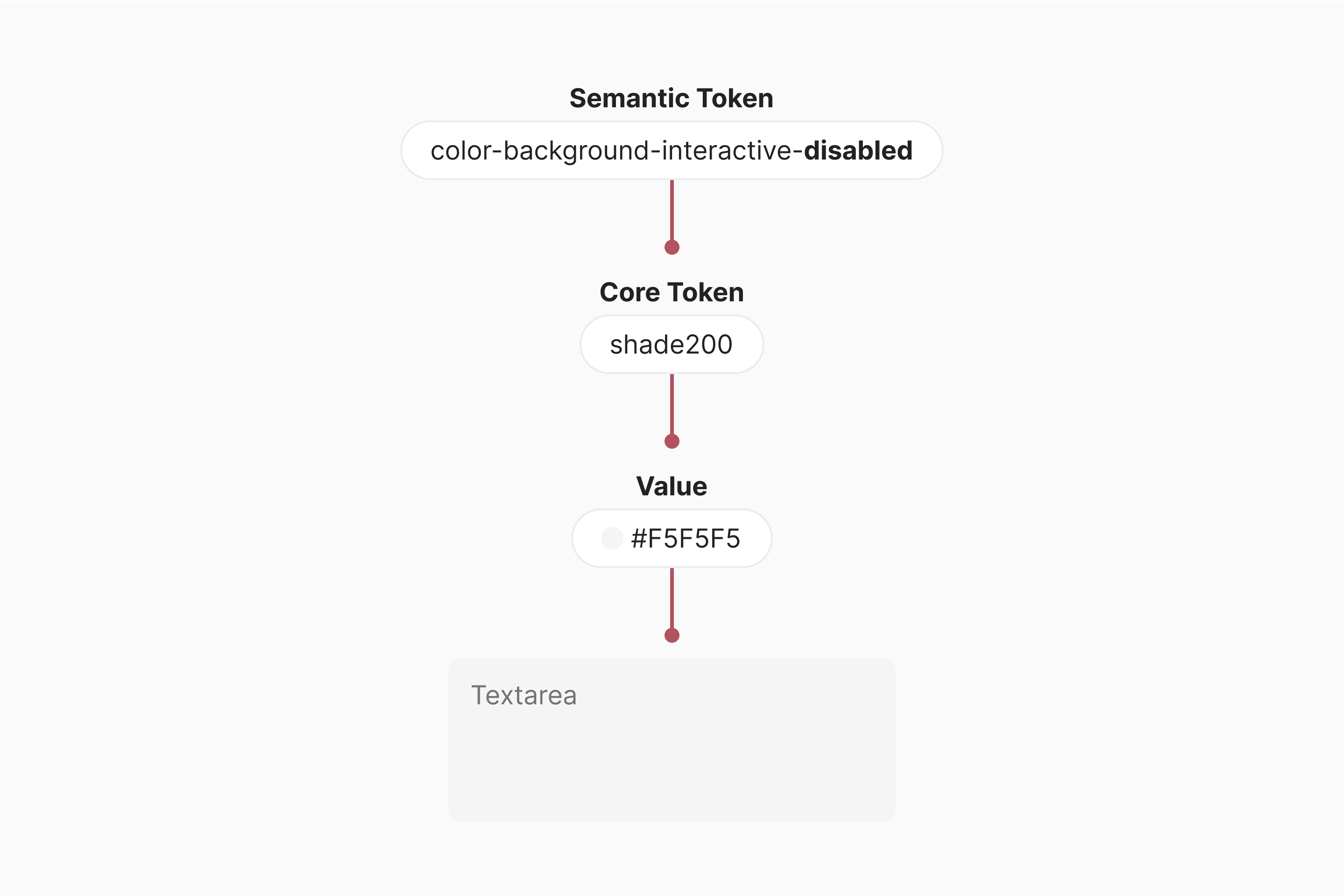
Our semantic tokens generally map to our core tokens. In a way, they’re the opposite of core tokens, since they’re opinionated and named after their purpose, rather than their value.
Why do we use design tokens?
Brand alignment
Our core color tokens are based on our brand colors. This helps Pleo look and feel the same to our customers across channels, products and platforms.
Consistency
Design tokens facilitate consistency in general, since they give us a limited set of values to pick from. Semantic tokens take this consistency to another level. They enable us to pick the same values for the same situations across platforms and product areas.
Efficiency
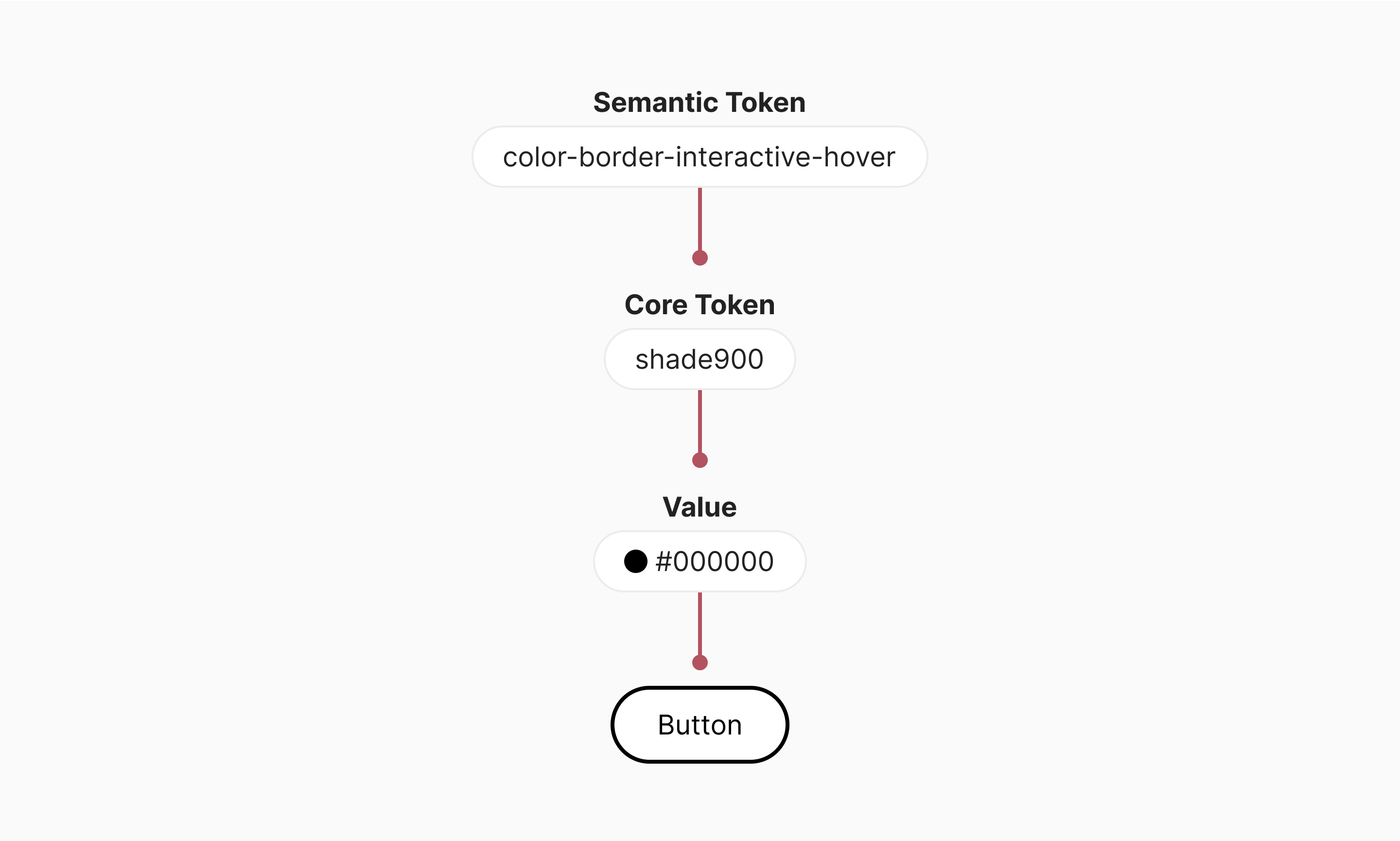
Semantic tokens make it easier and faster to make design decisions. For instance, if you need to
pick a color for the border of an interactive UI element in a hover state, you use
color-border-interactive-hover. No need to look through the product and mockups to find out
whether to use shade800 or shade900.
Scalability
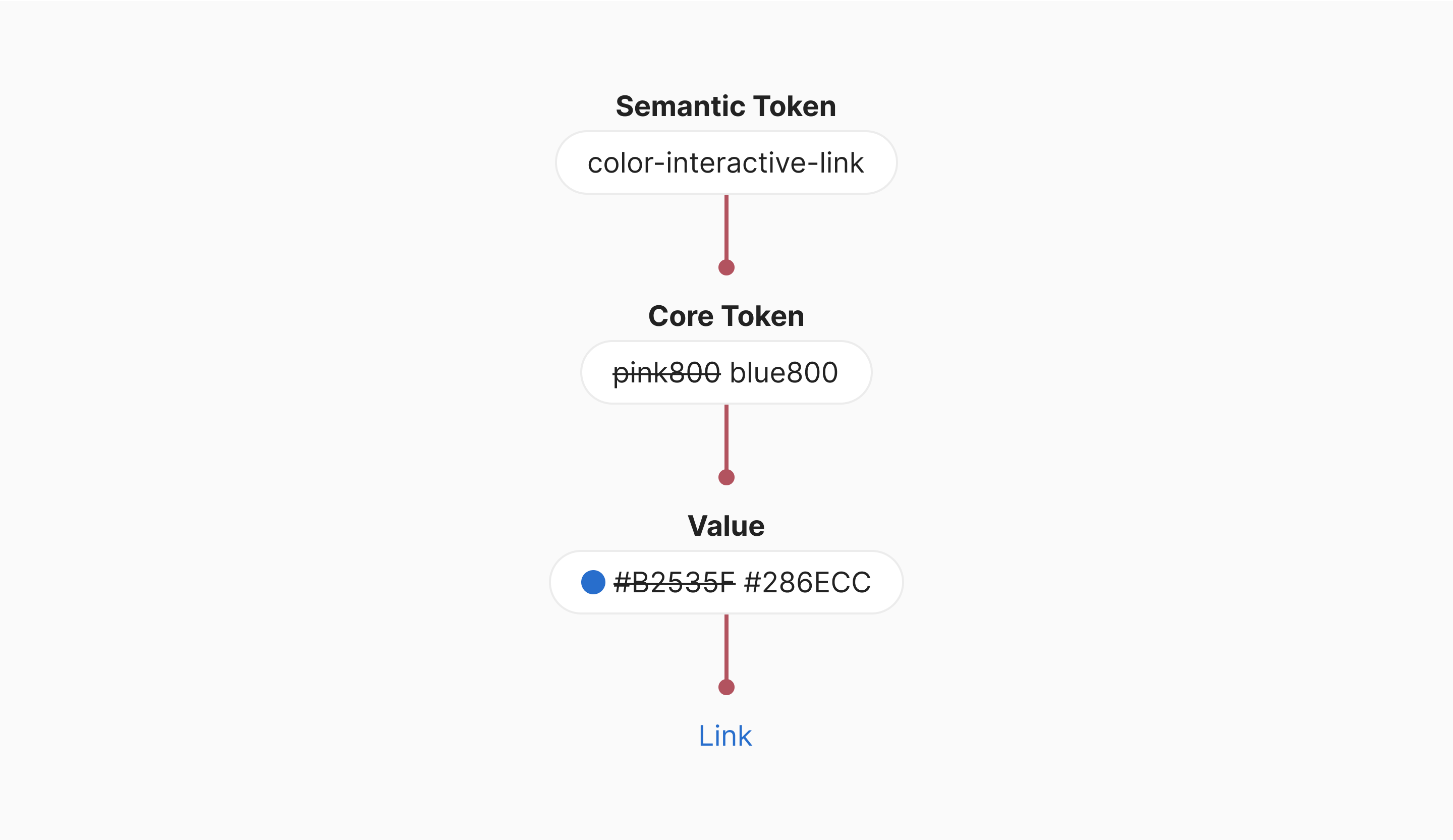
If we ever change our brand colors, design tokens make it relatively easy to update our product
accordingly. We would simply make our core color tokens map to the new brand colors. Similarly, if
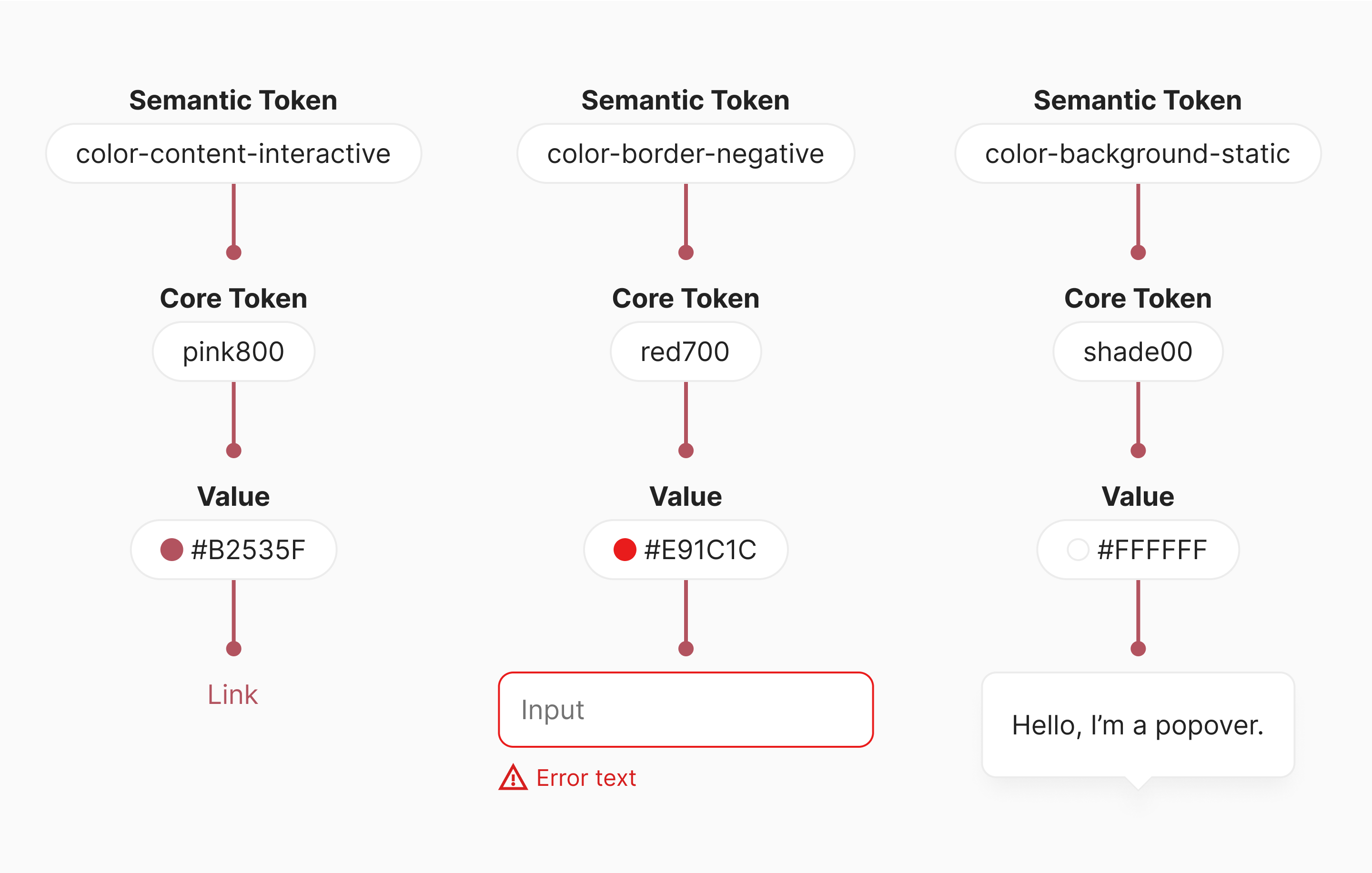
we decide links should be blue, we can remap the semantic token color-content-interactive-link
from pink800 to blue800.
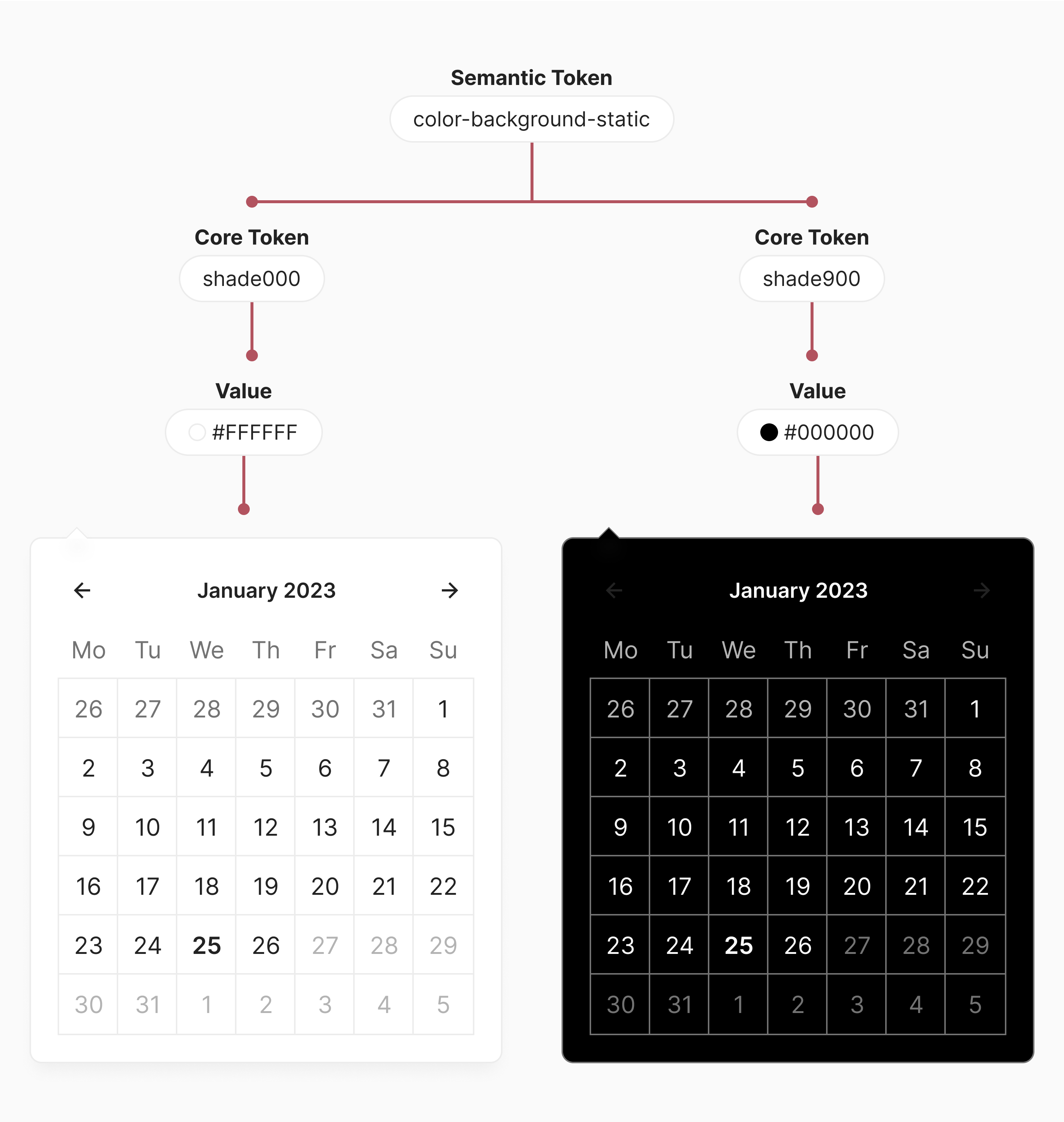
Theming
Every semantic color token maps to two core color tokens: one for light mode and one for dark mode. As a result, if you use semantic color tokens, you can design or develop for one theme and get the other theme for “free”.
Collaboration
Tokens are used both by designers and developers. As such, they provide a shared language that facilitates communication between these two groups. Clear communication enables better and more pleasant collaboration.
Extensibility
Although Telescope’s components cover many use cases, there will always be a need to create custom components. By designing and building custom components with design tokens, the benefits listed above are also reaped by product teams.
How do we name our tokens?
Our core tokens have short and simple names that reference the values they are mapped to. Examples
include spacing2, opacity20, and arc8.
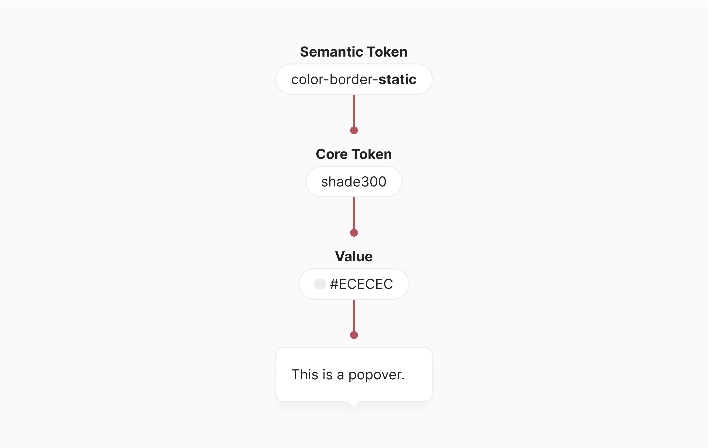
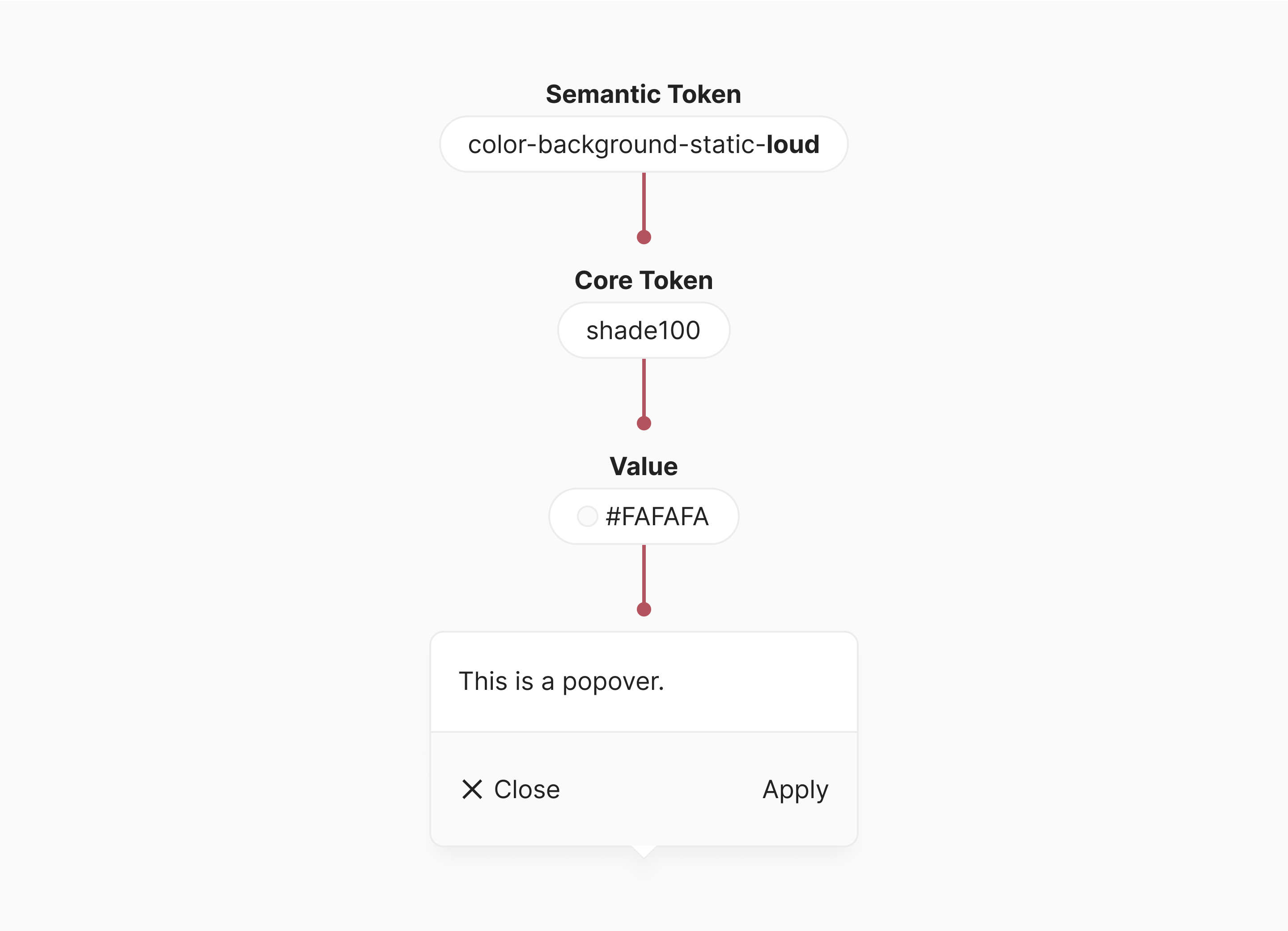
Our semantic tokens have names that reference their intended use and follow the naming scheme
attribute-property-role-variant-state. Attribute and role are required, while the other naming
scheme parts are optional.
Attribute
Attribute indicates which visual attribute the token concerns. The currently available attributes
are color and shadow.
Property
Property indicates which UI element property the token applies to. background, border, and
shadow speak for themselves, while content refers to both text and icons.
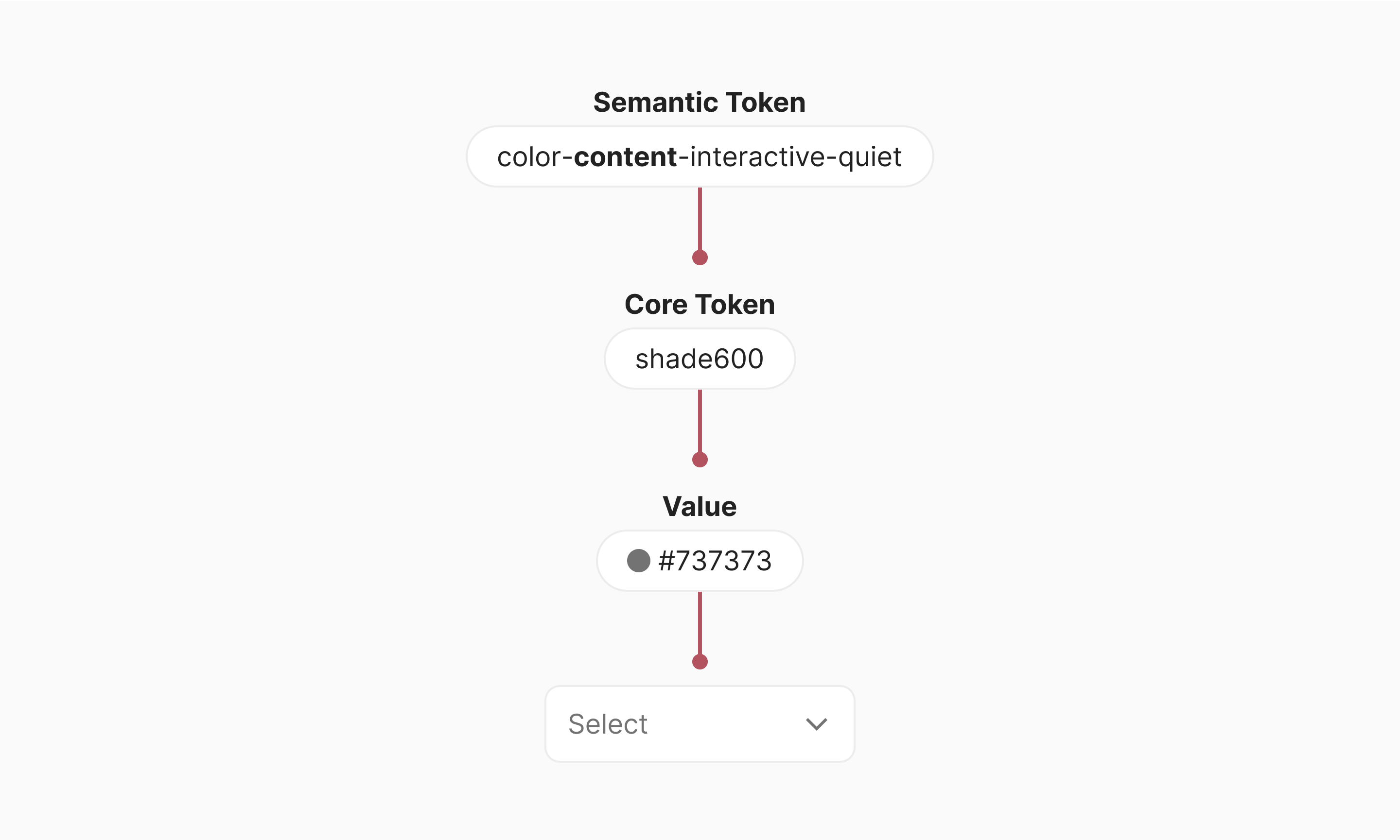
Role
Role indicates the UI element’s role in the UI. The two most used roles are interactive and
static. Use interactive for UI elements that react to a user’s interaction (click/tap).
Use static for UI elements that don’t react to a user’s interaction (click/tap).
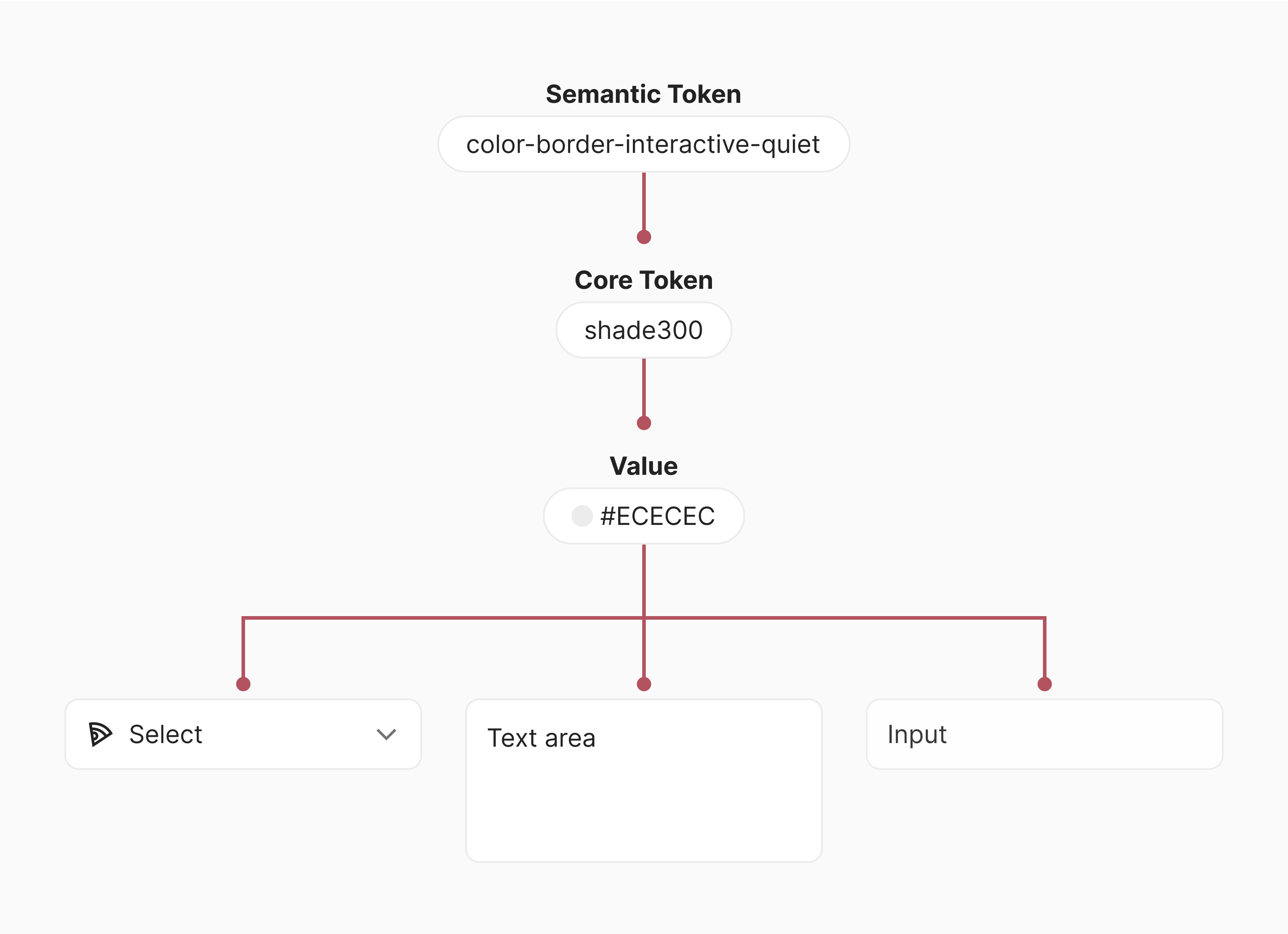
Variant
Variant is used for tokens that share the same attribute, property, and role, but have different
values. Frequently used variants are loud and quiet. Use loud when the UI element needs to
stand out.
Use quiet when the UI element needs to attract less attention.
State
State indicates the interactive state of the UI element (e.g. hover, disabled, selected, etc.).